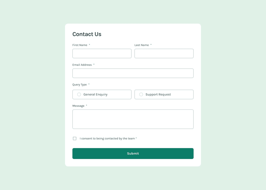
Design comparison
Solution retrospective
I think the accent-color is really cool
What challenges did you encounter, and how did you overcome them?I cannot uncheck both the radio & checkbox for an empty input before is submitted Any ideas will be appreciated
What specific areas of your project would you like help with?I cannot uncheck both the radio & checkbox for an empty input before is submitted Any ideas will be appreciated;
Community feedback
- @krushnasinnarkarPosted 4 months ago
Hi @Agyemang99,
Congratulations on successfully completing the challenge!
Your solution looks nice, though there are a couple of things you can improve which I hope will be helpful:
-
Form Responsiveness:
- Your form component is not responsive. This is likely because you haven't used any media queries in your CSS. Media queries are essential for adjusting the layout based on different screen sizes. You can learn more about them here or find tutorials on YouTube.
-
Error Handling:
- The error handling in your form doesn’t work properly. For instance, it displays error messages even if some fields are filled, and sometimes the form gets submitted without filling required fields. This issue is mostly due to your JavaScript logic. You can check out my JavaScript logic here or view the complete solution here for reference.
I hope you find this helpful, and I would greatly appreciate it if you could mark my comment as helpful if it was.Feel free to reach out if you have more questions or need further assistance.
Happy coding!
0 -
Please log in to post a comment
Log in with GitHubJoin our Discord community
Join thousands of Frontend Mentor community members taking the challenges, sharing resources, helping each other, and chatting about all things front-end!
Join our Discord
