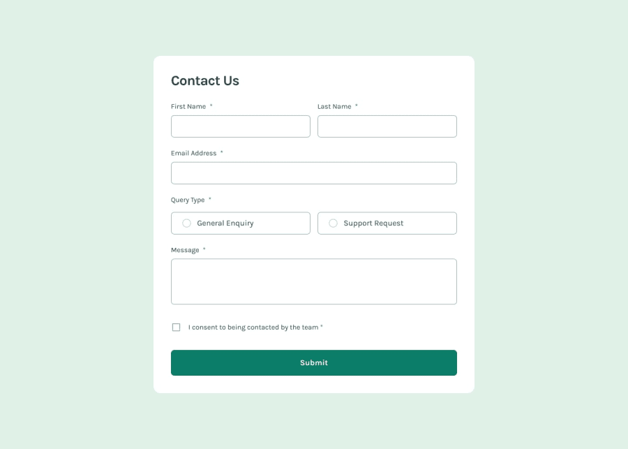
Design comparison
Community feedback
- @ARiYaNSEp0-0Posted 8 months ago
@faekhatami Hi. your result it's great. try to use css resets in your code. although when you get to using css frameworks they have that by default but when you are in vanilla css (without framework) you should add it yourself. there are a lot of css resets you can search which to use but fundamentally they are doing same thing. I recommend modern nomalize or https://www.joshwcomeau.com/css/custom-css-reset/. I think if your add heading tag for "Contact Us" inside header that would be great because header it's more like a wrapper around this things like introductary elements. try to use rem units more than px. px units are absolute and not responsive to user changes by default. although they are use cases for px too.
0 - @Ibtehaj-Ali-1Posted 8 months ago
Everything is Perfect!! It would be great if you make it interactive using Javascript. ✨
0@ARiYaNSEp0-0Posted 8 months ago@Ibtehaj-Ali-1 do you mean form validation ? because it's form elements they are already interactive
0
Please log in to post a comment
Log in with GitHubJoin our Discord community
Join thousands of Frontend Mentor community members taking the challenges, sharing resources, helping each other, and chatting about all things front-end!
Join our Discord
