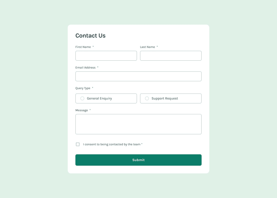
Design comparison
Solution retrospective
i completted it thought with alot of flaws.
What challenges did you encounter, and how did you overcome them?simplifying and writing reusable code . writting lesser javascript code.witting a lesser code has always been my plan before any project but trying to bring functionality to the arrow up and down was not difficult but space consuming and i would have love learning an even more shorter reusable code.
What specific areas of your project would you like help with?please practical input is welcome on how to write simple reusable code. aside input and review are welcome on this challenge as it is my first attempt
Community feedback
- @dolapobjPosted 8 months ago
Design looks great, you nailed it.
Looking at your JS some suggestions
- Use a CSS class for changing the color/border when displaying error messages. You can add this class to the element.
- Although it is clear (because I just completed my version of the project) it might be helpful to break your
appendFormfunction down with helper functions that validate each section.
Marked as helpful1 - @jolman009Posted 7 months ago
I hadn't seen this type of code on CSS --spacing-05: 0.125rem; --spacing-1: 0.25rem; --spacing-2: 0.5rem; --spacing-3: 0.75rem; Interesting Concept
0@echocode1Posted 7 months agothose can only happen in css framework like tailwind css bro @jolman009
0
Please log in to post a comment
Log in with GitHubJoin our Discord community
Join thousands of Frontend Mentor community members taking the challenges, sharing resources, helping each other, and chatting about all things front-end!
Join our Discord
