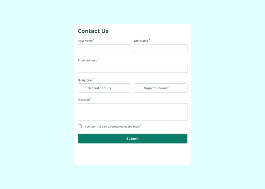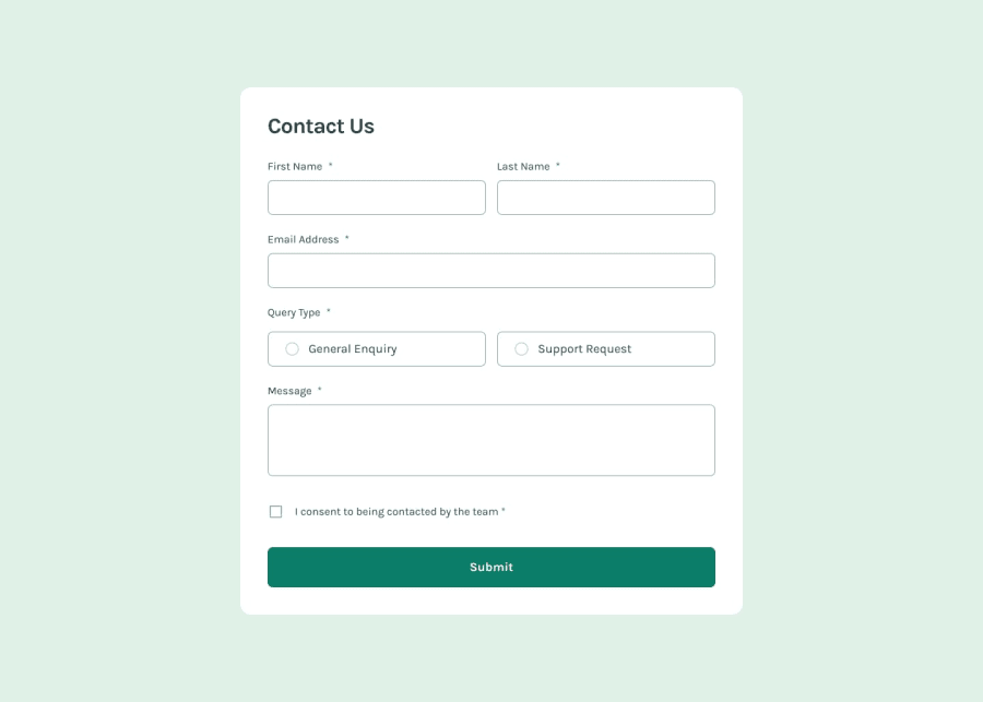
contact-form-main
Design comparison
Solution retrospective
The whole challenge was a nice exercise to practice accessibility and JavaScript Validation.
I've used AI a lot during the creating of the mark-up (for improving accessibility) and for the JavaScript Validation, so next time it would be better if done the work without using AI.
What challenges did you encounter, and how did you overcome them?I've encountered many challenges.
For indicating that a field is required I used an approach from accessibility-developer-guide.com that was recommended in the learning path of Frontend Mentor which use an `` file instead of a simple "*" string.
What specific areas of your project would you like help with?I would like help on how to style that query box with background-color: $green-200 whenever the radio input is checked.
I would appreciate any other help! 👍
Community feedback
- P@FixitoPosted 5 months ago
Good job! You could add a red border to invalid inputs and make the toast disappear after a few seconds.
Marked as helpful0
Please log in to post a comment
Log in with GitHubJoin our Discord community
Join thousands of Frontend Mentor community members taking the challenges, sharing resources, helping each other, and chatting about all things front-end!
Join our Discord
