Design comparison
Solution retrospective
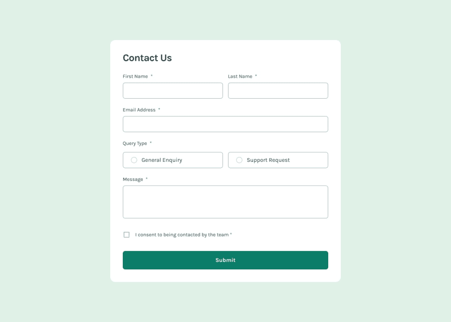
I'm proud of how I'm using CSS combined with TailwindCSS so that I can make a label look like an input and give it a different color like in the design. And the second thing is for my JS code, I'm making sure that once the user finish input their contact information and the output of the validation data is good, the browser will send the data manually using submit function and the page will reload.
What challenges did you encounter, and how did you overcome them?It is really hard to keep up with the design, especially for the radio input, I can't change the color of the input to green so that I have to make the radio input manually using CSS.
What specific areas of your project would you like help with?Perhaps for the radio input, how to change the color so that I don't have to create it manually just for changing the color from blue to green.
Community feedback
Please log in to post a comment
Log in with GitHubJoin our Discord community
Join thousands of Frontend Mentor community members taking the challenges, sharing resources, helping each other, and chatting about all things front-end!
Join our Discord
