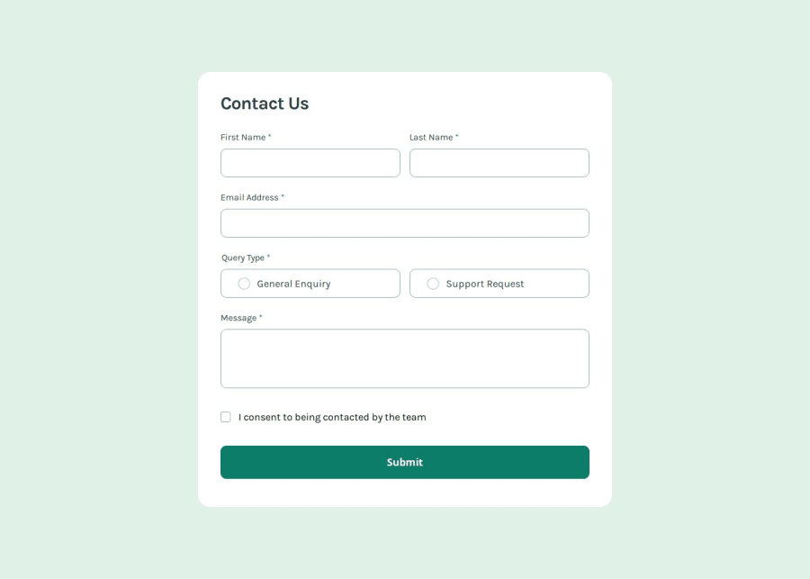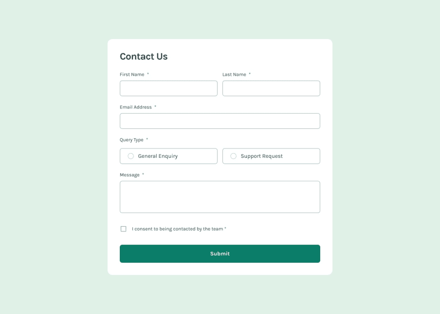
Design comparison
Solution retrospective
I'm proud of how I implemented the contact page with a focus on web accessibility, making sure it's usable for everyone. The form validation works well to ensure correct inputs. I also like how the UI design turned out, keeping it clean and user-friendly. Next time, I’d improve the code structure for easier maintenance. Additionally, I plan to further enhance the responsiveness across different devices.
This should be clear and to the point for your retrospective!
What challenges did you encounter, and how did you overcome them?One challenge I faced was ensuring the form validation worked smoothly across all browsers while maintaining accessibility. To overcome this, I researched best practices for accessible form validation and tested it on different browsers to fix any inconsistencies. Another challenge was designing a responsive UI that looks good on all devices. I tackled this by using a mobile-first approach and testing frequently during development to ensure everything scaled properly.
What specific areas of your project would you like help with?I’d like help with improving the accessibility of my form validation messages, especially for screen reader users. Feedback on making my code more maintainable and scalable would also be appreciated. Additionally, I’m seeking suggestions on optimizing the UI for larger screens without losing the mobile-first approach. Lastly, any advice on improving the page’s loading performance would be valuable.
Community feedback
- @AdrianoEscarabotePosted 6 months ago
Hello Mudasir Nadeem, how are you? I was really pleased with your project, but I’d like to offer some advice that might help:
Consider using
remfor font sizes. When font sizes are set in absolute units like pixels, users can't adjust the text size based on their preferences. Relative units likeremadapt to the screen size and user settings, making them more flexible across various devices.If you'd rather keep using
px, you can download a handy VS Code extension that converts pixels toremautomaticallylink -> px to rem
The rest is spot on.
Hope it’s helpful to you. 👍
0@mudasirNadeemPosted 6 months ago@AdrianoEscarabote thats greate I am very happy from your feedback and your link yea i will used rem that is right because rem is responsive unit thank you for your feedback
1
Please log in to post a comment
Log in with GitHubJoin our Discord community
Join thousands of Frontend Mentor community members taking the challenges, sharing resources, helping each other, and chatting about all things front-end!
Join our Discord
