Design comparison
SolutionDesign
Solution retrospective
What are you most proud of, and what would you do differently next time?
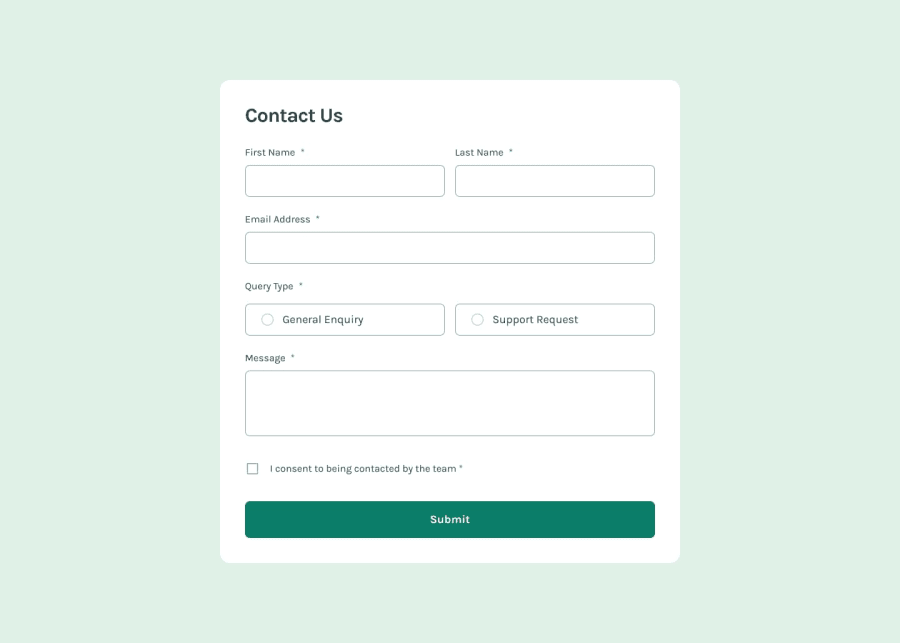
Further developement will definitely change the structure surrounding the toast message. I essentially structured the toast message and the contact form as "one" so when the toast message is activated, it will appear on top of the contact form and create space for the toast message by "pushing" the contact form down.
Community feedback
Please log in to post a comment
Log in with GitHubJoin our Discord community
Join thousands of Frontend Mentor community members taking the challenges, sharing resources, helping each other, and chatting about all things front-end!
Join our Discord
