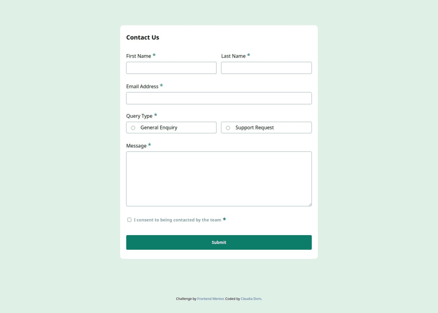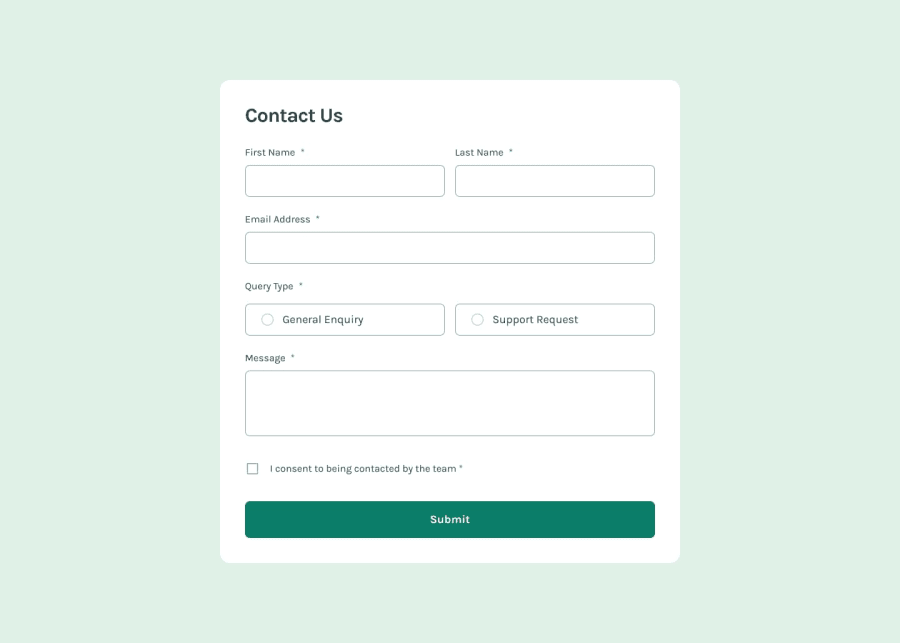
Design comparison
Solution retrospective
I am learning about accessibility, and I would appreciate any advice on how to improve.
Community feedback
- @dylan-dot-cPosted 5 months ago
Everything here looks good, and a11y seems well, loved how u handled the aria attributes.
One issue with the design, the textarea you have for the message is still resizeable(on msedge) so you can disable the resize feature by using
resize: none;in css. Other than that everything is good.Would love to learn more about a11y as the most I went to is making these challenges keyboard accessible not sr accessible. I don't want to do it blindly so I might need to install a sr to test myself.
0
Please log in to post a comment
Log in with GitHubJoin our Discord community
Join thousands of Frontend Mentor community members taking the challenges, sharing resources, helping each other, and chatting about all things front-end!
Join our Discord
