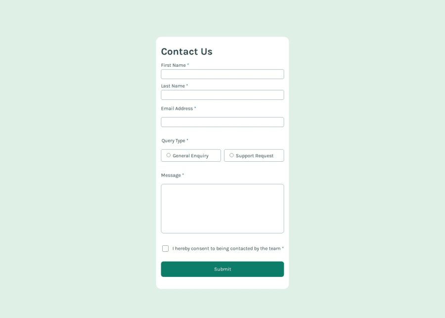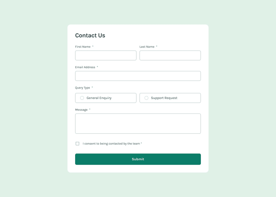
Contact form focused on accessibility
Design comparison
Solution retrospective
I'm proud of the way my solution turned out, and prioritizing accessibility from the start made it easier to maintain and check accessibility throughout building the form. Next time I would take more time to understand how the error messages work before starting in order to plan how to build the functionality more accurately.
What challenges did you encounter, and how did you overcome them?My biggest problems were aligning the error messages, which was surprising because usually I struggle more with JavaScript. I used stack overflow to help.
What specific areas of your project would you like help with?I would love feedback on my JavaScript, and how I can create cleaner, more concise code.
Community feedback
- @salomasikPosted 5 months ago
Cool! there is a problem when displaying a block with “Successful sending of message”, I tried giving the exact width and changing the Left and right properties
1
Please log in to post a comment
Log in with GitHubJoin our Discord community
Join thousands of Frontend Mentor community members taking the challenges, sharing resources, helping each other, and chatting about all things front-end!
Join our Discord
