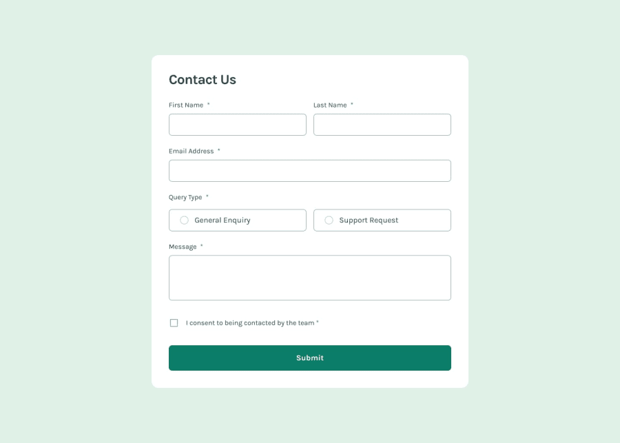
Design comparison
SolutionDesign
Solution retrospective
What are you most proud of, and what would you do differently next time?
The thing i'm most proud of is the theme i configured. It's the second time i make a theme for an app, and it was easier this time, so i was able to focus more on the form. Next time i'd like to organize my widgets better to make them reusable and responsive to different screen sizes
What challenges did you encounter, and how did you overcome them?Making a validator for every input field was harder than expected, but having good docs about Flutter widgets made the difference
What specific areas of your project would you like help with?I'd like to know if there are any common code structure to make a project that's readable, reusable and maintainable for future projects
Community feedback
Please log in to post a comment
Log in with GitHubJoin our Discord community
Join thousands of Frontend Mentor community members taking the challenges, sharing resources, helping each other, and chatting about all things front-end!
Join our Discord
