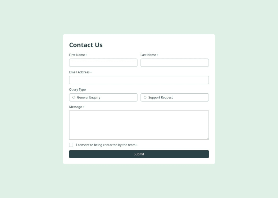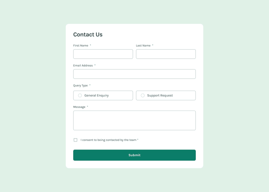
Design comparison
Solution retrospective
I applied new grid concepts to make the layout responsive. Instead of using grid areas like I normally do, I decided to use grid template columns and assign the amount of space each element should take.
What challenges did you encounter, and how did you overcome them?It was a challenge to manage the layout state of the inputs and the error messages when an error occurred, I thought of using siblings selector but for certain cases it was cumbersome, so I just added a special class to every input and changed the style of both the input and the error message to appear in case of an error
What specific areas of your project would you like help with?I think I did a good enough job in the JS part of my project but I would like to hear if I could have done it any better
Community feedback
- @Samuel-501Posted 4 months ago
I absolute love your application of css in this code it's really wonderful
1 - @mohammed-aljablaiPosted 4 months ago
I really like you website and the touch you put, However, I believe that it will be better if you tye email filed check if it was the input correct or not.
1
Please log in to post a comment
Log in with GitHubJoin our Discord community
Join thousands of Frontend Mentor community members taking the challenges, sharing resources, helping each other, and chatting about all things front-end!
Join our Discord
