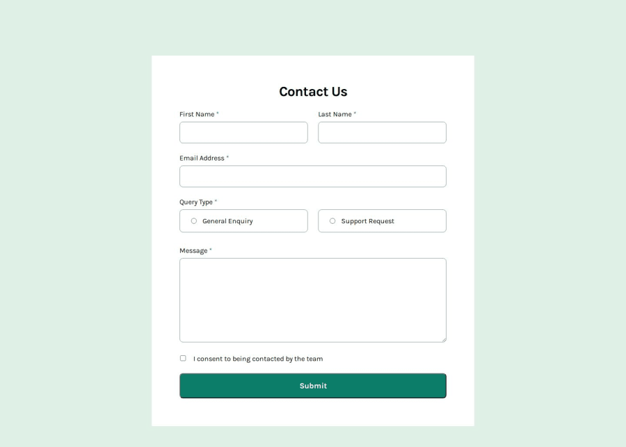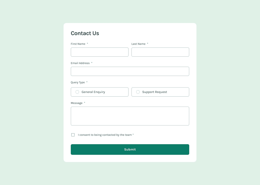
Design comparison
Solution retrospective
I wanted to try grid instead of flexbox to create this form. I thought it functioned the same way that the app is intended to. In terms of deciding between flex and grid. I guess it's dependent on the circumstances.
What challenges did you encounter, and how did you overcome them?It took awhile to get the margin to be responsive when you move to mobile --> tablet --> desktop and vice versa. I didn't get the margins to what is in the Figma design, but it's close enough that it doesn't much of that jerk motion when you transition.
What specific areas of your project would you like help with?Probably the margins thing from the previous answer. I want to know if there's a better way to code the success message after you submit the form or if my way is fine or if my code needs tweaking.
Community feedback
Please log in to post a comment
Log in with GitHubJoin our Discord community
Join thousands of Frontend Mentor community members taking the challenges, sharing resources, helping each other, and chatting about all things front-end!
Join our Discord
