


Design comparison
Solution retrospective
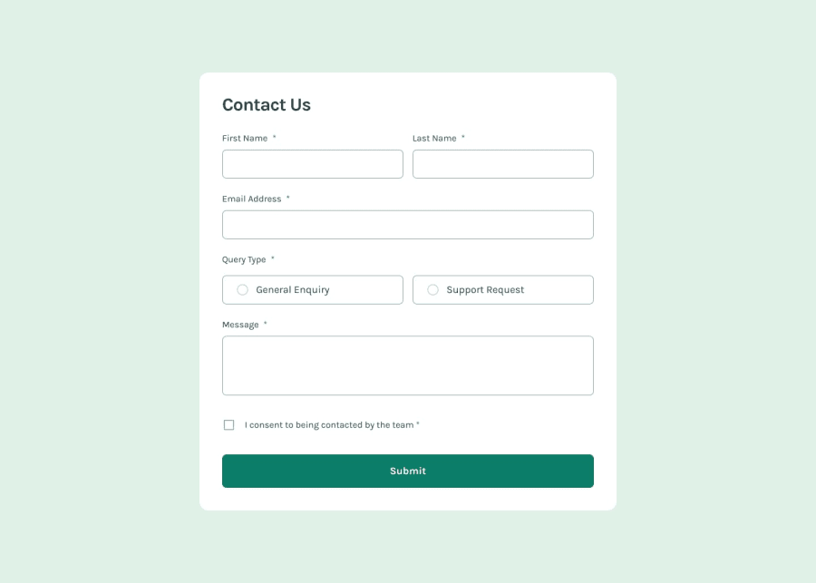
As always, I'm just proud that I was able to complete the challenge and come up with a way to have the contact form do all it was supposed to. Also, I found it tricky to use the svgs in a way that ended up looking as the design, but I eventually found out a way with some help from YouTube.
What I'd do differently next time is the form validation as a whole. The process is, I feel, unnecessarily convoluted. I have a single function in charge of validating all inputs, and I feel like it's better to have many functions do one thing very well than having one function do everything.
What challenges did you encounter, and how did you overcome them?Two main ones that I actually didn't know how to solve and just ended up giving up:
- The way I implemented the error styling made it so that whenever the border-color of an element was changed to red, said element totally lost all focusing functionallity. Given that this challenge was about accessibility, loosing the focus states is a pretty big deal.
- My page doesn't seem to be displaying any focus states for the radio buttons. I'm pretty sure I'm missing something obvious, but at this point, my brain is fried.
Pretty much the above stated points. Any help with that would be greatly appreciated.
Please log in to post a comment
Log in with GitHubCommunity feedback
- @tortaruga
hi, for the error styling getting rid of focus I think it's because you have set outline to none, so technically they don't get visually focused even when the border is not red. i just removed the border and used the outline instead:
input:focus, textarea:focus {
    outline: 1px solid var(--dark-green);
    border: none;
}
and then changed the color of the outline to red when the input is invalid.
for the radio buttons (and i think the checkbox too) the problem might be that the focusable element is the input itself, which in your case is hidden so that you could use the svg icons in its place. I think you could try resolving it by using the property tabindex="0" which makes normally non-focusable elements focusable, but I'm not sure how because the element you have to apply it to is the ::before element of the label. sorry i'm not very good at this, I didn't use the icons I just styled the inputs like this
input[type="checkbox"], input[type="radio"] {
    accent-color: var(--dark-green);
}
i hope something was useful!
Marked as helpful

Join our Discord community
Join thousands of Frontend Mentor community members taking the challenges, sharing resources, helping each other, and chatting about all things front-end!
Join our Discord