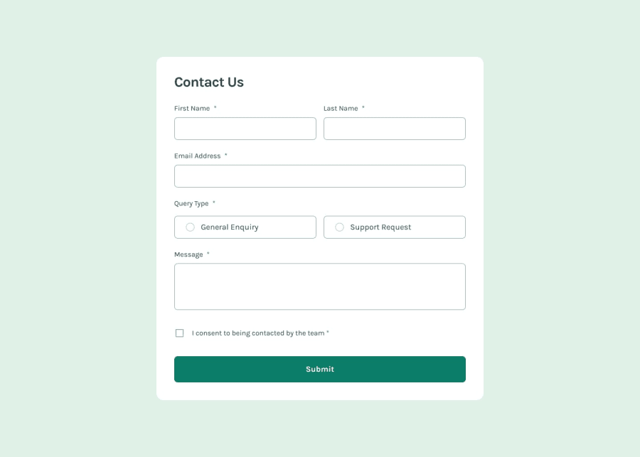
Contact form built with Javascript
Design comparison
Solution retrospective
🛸 Hello FEM Community! I'm Daniel and this is my solution for this challenge! 😊
🛠️ Built with:
- HTML 🧾
- JavaScript 🤖
- BEM Notation 🅱️
- Mobile first workflow approach 📲
Very nice accessibility test. I think I managed to add all the required features.
If you have any suggestions on how I can improve this project, feel free to leave me a comment!
Feedback welcome 😊
Community feedback
- @DeyanTopalovPosted 8 months ago
Hey @danielmrz-dev, congrats on yet another great solution!
Just one small thing on my end - currently your text inputs have font-size of 11px. Perhaps you are following the design (tbh I have not checked the challenge details yet).
But on mobile when the input has smaller than 16px font size, the browser automatically zooms in (A LOT) when the input is selected, without automatically zooming back to normal view. This might lead to not the best UX on mobile. The best way to avoid this is to always have font size of 16px or bigger on your text input areas.
Hope this helps & keep the good work!
1@danielmrz-devPosted 8 months ago@DeyanTopalov Which browser are you using?
I always test my solutions both on mobile and desktop to check if everything is working fine before posting it. I did with this one too and this behavior is not happening here.
Could this be your browser settings maybe?
0@DeyanTopalovPosted 8 months ago@danielmrz-dev I am using Safari on IOS 17.4. & the ARC browser - both apps updated to their latest version.
I have not checked this on Chrome or Mozilla.
If it will help, I can send you screenshots on discord
0
Please log in to post a comment
Log in with GitHubJoin our Discord community
Join thousands of Frontend Mentor community members taking the challenges, sharing resources, helping each other, and chatting about all things front-end!
Join our Discord
