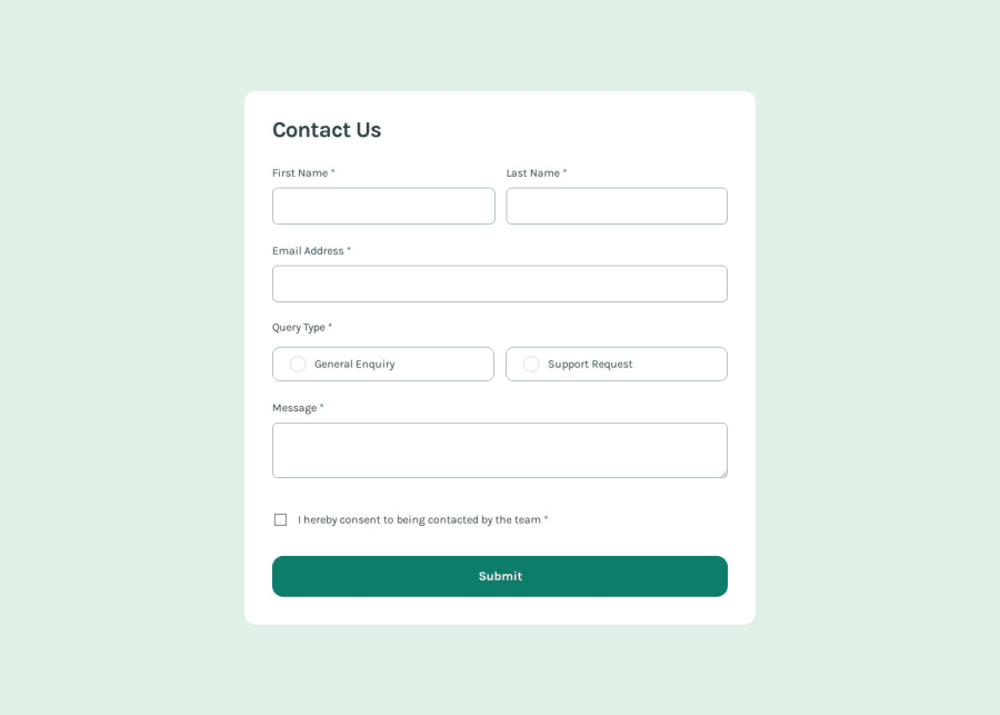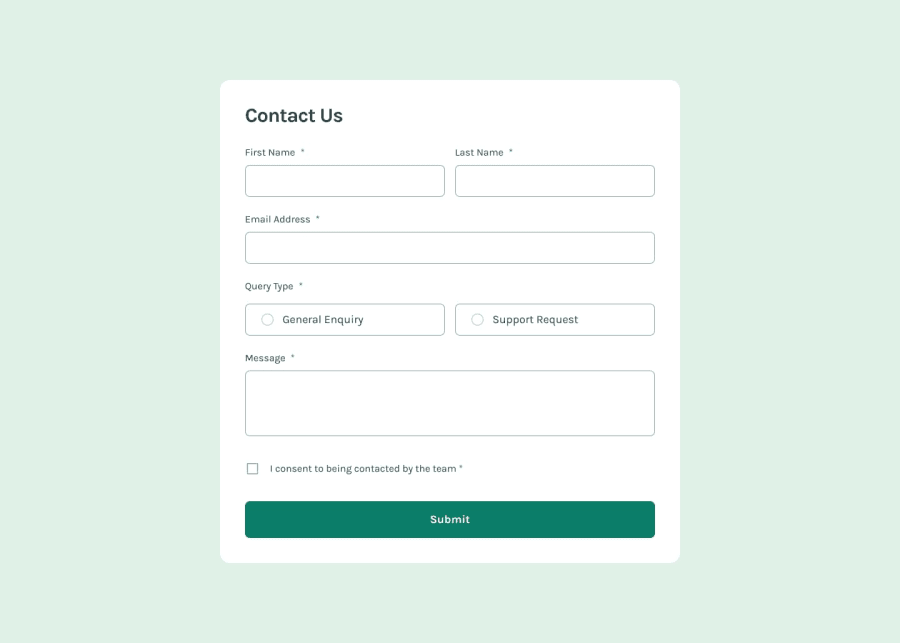
Design comparison
Solution retrospective
I placed more focus on using aria-labels in this project.
What challenges did you encounter, and how did you overcome them?I found it a little challenging to style the radio and checkbox according to to design. I eventually came up with a solution which works but I'm guessing there is probably a better way to do it.
What specific areas of your project would you like help with?All feedback and suggestions for improvement are welcome.
Please log in to post a comment
Log in with GitHubCommunity feedback
- @vgarmy
You've demonstrated strong coding skills with well-structured and clean code. Your next step could be to explore React Vite for a faster development experience and consider using a CSS framework to streamline styling.
Join our Discord community
Join thousands of Frontend Mentor community members taking the challenges, sharing resources, helping each other, and chatting about all things front-end!
Join our Discord
