Design comparison
Solution retrospective
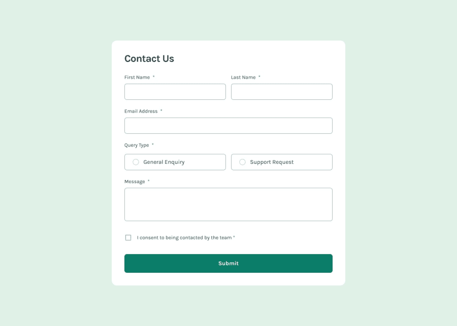
I am most proud of successfully implementing a responsive contact form using HTML, CSS, and JavaScript. Ensuring a seamless user experience across different devices was challenging but rewarding.
What challenges did you encounter, and how did you overcome them?Challenges Encountered:
Form Validation: Implementing robust form validation that provides clear feedback to users without cluttering the interface.
Responsive Design: Ensuring the form looks and functions well across various screen sizes and devices.
How I Overcame Them:
Form Validation: I researched best practices for form validation and used JavaScript to implement real-time validation feedback. I also utilized CSS to visually highlight errors and guide users toward correct inputs.
Responsive Design: I employed CSS media queries to adjust the form's layout and styling based on different viewport sizes. Testing on various devices helped identify and resolve layout issues.
Community feedback
Please log in to post a comment
Log in with GitHubJoin our Discord community
Join thousands of Frontend Mentor community members taking the challenges, sharing resources, helping each other, and chatting about all things front-end!
Join our Discord
