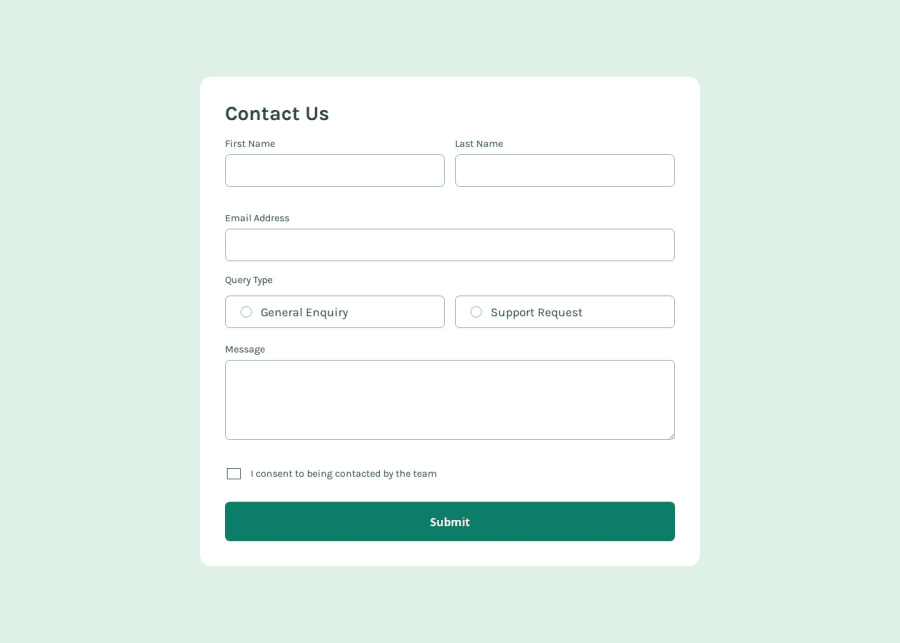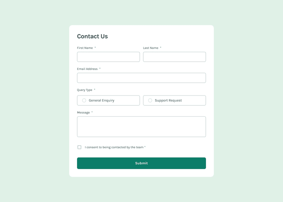
Design comparison
Please log in to post a comment
Log in with GitHubCommunity feedback
- @gmagnenat
Hello, I'm afraid there are issues in this solution and it needs more work to be accessible.
If you try now with a screenreader, you'll notice the first element announced is the title and then the icon and success message. Nothing else is announced unless I press tab to go to the first form input. If I accidently press enter, no error message are announced so I have no idea what is going on.
There are also some fundamentals concepts that are not covered, it should be all understood at this challenge if you take the learning path and get good feedback on your easier challenges.
Here is a short list of pointers to check up.
- you need a <main> landmark to indicate where the main content of the page is.
- it's more performant and advises to load the font from your HTML instead of your CSS
- use a modern CSS reset at the top of your stylesheet in all your projects
- I would use an eventListener for the submit event instead of an onsubmit, cleaner and more modern.
- you need to add some aria for the errors. I found this article interesting and covering of lot of use case https://www.smashingmagazine.com/2023/02/guide-accessible-form-validation/
I hope this helps you understand more what is needed for an accessible solution.
Don't hesitate to reach out with your questions on the discord.
Join our Discord community
Join thousands of Frontend Mentor community members taking the challenges, sharing resources, helping each other, and chatting about all things front-end!
Join our Discord
