Design comparison
Solution retrospective
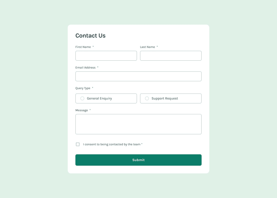
couldn't figure out the query section. css is not finished. the icons are not placed properly.
What specific areas of your project would you like help with?would like some guidance on the problems I stated in the previous section.
Community feedback
- @meelixPosted 6 months ago
wrap the radio and the text label (like a span) inside a label and style the actual label with
label:focus-within
and/orlabel:has([type="radio"]:focus)
andlabel:has([type="radio"]:user-invalid)
.querytype label input[type=radio] span.textlabel label input[type=radio] span.textlabel span.errormsg
1 - @pritxxhPosted 6 months ago
The solution includes semantic HTML which is great for accessibility. The layout looks good on various screen sizes due to the responsive design approach. However, there are some areas for improvement:
1. Accessibility could be enhanced by adding proper aria labels, role attributes, and keyboard navigation support. 2. The code structure could be more modular, with separate files for CSS, JavaScript, and better organization of components. 3. While the layout matches the design, there could be minor differences in spacing, font sizes, or colors that could be fine-tuned. 4. The code could be made more reusable by abstracting common functionality into separate functions or modules.
Overall, it's a solid solution that meets the requirements, but with some tweaks to accessibility, code structure, and attention to detail, it could be even better.
0
Please log in to post a comment
Log in with GitHubJoin our Discord community
Join thousands of Frontend Mentor community members taking the challenges, sharing resources, helping each other, and chatting about all things front-end!
Join our Discord