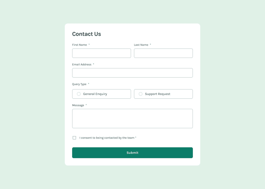
Design comparison
Community feedback
- @AdrianoEscarabotePosted about 1 month ago
Hey Yosef Hayim, how’s it going? I was really impressed with your project’s result, though I have some advice that could be helpful:
Consider using
remfor font size .If your web content font sizes are set in absolute units, such as pixels, the user will not be able to re-size the text or control the font size based on their needs. Relative units “stretch” according to the screen size and/or user’s preferred font size, and work on a large range of devices.if you want to continue coding with
px, you can download a very useful extension in vscode, it convertspxtorem!link -> px to rem
You have used <br> , using <br> is not only bad practice, it is problematic for people who navigate with the aid of screen reading technology. Screen readers may announce the presence of the element. This can be a confusing and frustrating experience for the person using the screen reader.
Everything else looks great.
Hope this helps! 👍
0
Please log in to post a comment
Log in with GitHubJoin our Discord community
Join thousands of Frontend Mentor community members taking the challenges, sharing resources, helping each other, and chatting about all things front-end!
Join our Discord
