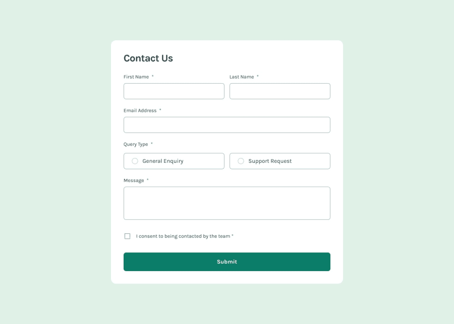
Design comparison
SolutionDesign
Solution retrospective
What are you most proud of, and what would you do differently next time?
I think I managed to get most of it right.
What challenges did you encounter, and how did you overcome them?Styling the radio buttons and the checkbox was challenging - I had to research to get it right.
Form validation was also a bit tricky, especially figuring out when an element is "checked" or not using JavaScript. I couldn't figure out the radio buttons, so I added a default checked attribute in the HTML itself.
Community feedback
- @g-uriartePosted 6 months ago
Nice transition used in the 'query type' inputs.
1@Islandstone89Posted 6 months ago@g-uriarte Thanks! I must admit I had to look it up, though :P
1
Please log in to post a comment
Log in with GitHubJoin our Discord community
Join thousands of Frontend Mentor community members taking the challenges, sharing resources, helping each other, and chatting about all things front-end!
Join our Discord
