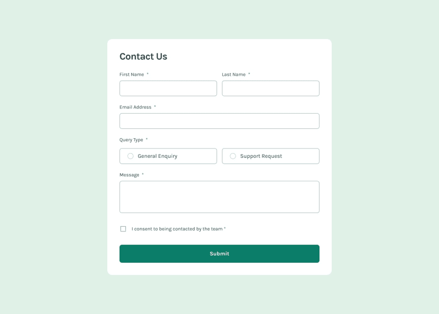
Design comparison
Solution retrospective
Getting the sizing correct and have it scale properly from phone to desktop. I would better label and created enough divs so that everything has its own place
What challenges did you encounter, and how did you overcome them?getting the two inputs on the same line and having them span the whole way. I had to create more divs than I had thought i would. the javascript i have not touched yet going to revisit once i study javascript more
What specific areas of your project would you like help with?if someone would walk me through the javascript and how to change the radio buttons to have the svg be the button.
Community feedback
- @kodan96Posted 6 months ago
hi there! 👋
You have to replace the radio button with divs that contain the svg, apply
display: none;on the radio button, then set up the page with Js to toggle the svg-s and the invisible radio button as well.Or I guess its also a solution if you make the radio button transparent, and scale it up, so it takes up the entire space of the svg, so there's no need to toggle it with js, but you still need to toggle the svg.
Hope this helped 🙏
Good luck and happy coding! 💪
1
Please log in to post a comment
Log in with GitHubJoin our Discord community
Join thousands of Frontend Mentor community members taking the challenges, sharing resources, helping each other, and chatting about all things front-end!
Join our Discord
