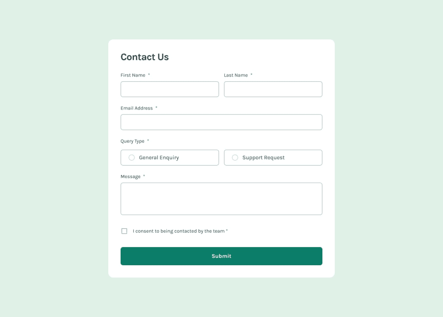
Design comparison
SolutionDesign
Solution retrospective
What are you most proud of, and what would you do differently next time?
I hope my projects become more accessible.
What challenges did you encounter, and how did you overcome them?It's still tough to figure out the accessibility features.
What specific areas of your project would you like help with?Help is always appreciated.
Community feedback
- @kaamiikPosted 2 months ago
Hi! Congratulations on completing this challenge. I noticed a few things in your code that I’d like to share:
- First, I couldn't see your error messages right away; they only appeared after some time. You should consider adding the
novalidateattribute to your<form>tag and handling form validation with JavaScript. - I see an asterisk on every label element. You could use a
visually-hiddenclass to make that asterisk accessible to screen readers, eliminating the need to mark fields asrequired. Alternatively, you can keep therequiredproperty and skip thevisually-hiddenclass. - There's no need to use a
<footer>tag here. All form elements should be inside a<form>tag and wrapped within the<main>tag. - Your toast message should disappear after a short time. You can use
setTimeoutin your JavaScript to achieve this.
Aside from these points, everything looks great! Keep up the good work!
0 - First, I couldn't see your error messages right away; they only appeared after some time. You should consider adding the
Please log in to post a comment
Log in with GitHubJoin our Discord community
Join thousands of Frontend Mentor community members taking the challenges, sharing resources, helping each other, and chatting about all things front-end!
Join our Discord
