


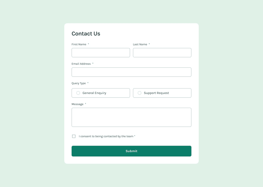
Design comparison
SolutionDesign
Community feedback
- @gmagnenatPosted about 2 months ago
Hi, congratulations on your work! I noticed a few areas that could be improved to enhance accessibility, maintainability, and usability.
Accessibility Improvements
- A
<main>landmark is missing. This helps screen readers identify the primary content of the page. Make sure it wraps the main section of your document. - If there is no specific action required for the
<form>, remove theactionattribute to prevent unnecessary requests. - The
autocompleteattribute should not be empty. Use meaningful values like"given-name","family-name", and"email"to improve form usability and autofill functionality. - Inputs should be linked to their respective error messages using
aria-describedby. This allows assistive technologies to associate input fields with error messages. - Errors should be populated dynamically and added to the DOM at validation time so that screen readers announce them properly.
<p>elements should not be placed inside<legend>. Instead, use plain text directly within<legend>.
User Experience Enhancements
- When a success message appears, users may still be at the bottom of the form and could miss it. Announce the message to screen readers using
aria-live="polite"and scroll to the top programmatically to make it visible.
CSS and Performance Considerations
- Import fonts directly in your HTML file for better performance rather than relying on external stylesheets that load them later.
- Avoid setting the default font size to
62.5%. This practice can cause accessibility issues. Read more about why this approach is not recommended here: Why you shouldn't use 62.5%. - Use
remfor elements containing text rather than fixed pixel values. This allows layouts to scale properly if users modify their browser's default font size. - Avoid using
pxfor width, height, and font sizes, as it prevents accessibility adjustments. Convert these values torem. - Remove fixed pixel heights on inputs and instead use appropriate
paddingandfont-sizeto keep them flexible.
SCSS Organization and Maintainability
- Be mindful of deeply nested selectors in your SCSS. Limit nesting to a maximum of two levels and prioritize low specificity. Increasing specificity unnecessarily can make stylesheets harder to debug, especially in larger projects.
Testing and Final Checks
- I highly recommend testing your solution with a screen reader. NVDA is a great option for Windows, and VoiceOver is available on Mac. You may notice elements being announced incorrectly, which will help improve your HTML for better accessibility.
I hope this feedback helps improve your project! Let me know if you need any clarification.
Happy coding! 🚀
0 - A

Please log in to post a comment
Log in with GitHubJoin our Discord community
Join thousands of Frontend Mentor community members taking the challenges, sharing resources, helping each other, and chatting about all things front-end!
Join our Discord