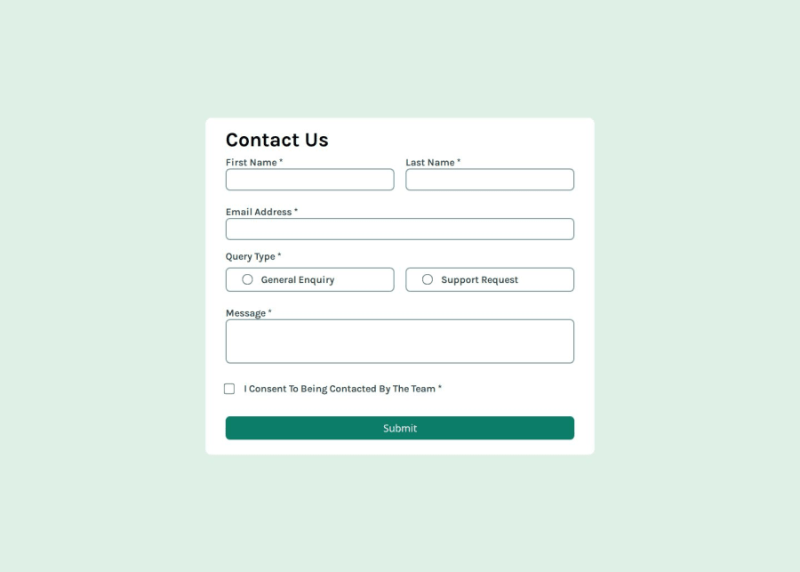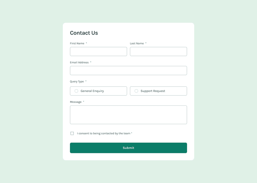
Design comparison
Solution retrospective
I’m most proud of implementing real-time validation with accessible error messages, which improves usability for screen readers and provides immediate feedback for users. If I could do it again, I’d focus more on refining error-handling logic and exploring more advanced accessibility techniques, like dynamic ARIA live regions for validation updates.
What challenges did you encounter, and how did you overcome them?- One of the main challenges was properly validating and updating the appearance of radio buttons when checked. Initially, I mistakenly used .forEach() instead of .some(), which complicated validation checks. The aim was to validate the selection and change the background colour of the selected radio label efficiently. iIcorporating .some() allowed me to more easily determine if at least one radio button was selected, simplifying the validation logic.
Debugging the radio button styling was another hurdle. I needed to ensure the correct background colour appeared only when a button was selected, removing the style if unchecked. By creating functions to manage background and border changes, I achieved a cleaner, dynamic approach that adapted to the user's interactions.
- The first solution led me to this challenge of the handleQueryType (or validateQueryType) function, which was returning undefined due to the use of the .forEach() method. Because .forEach() does not return a value, I couldn’t easily check if any radio button was selected.
To fix this, I refactored the function to use Array.from().some() only, allowing me to check if any radio button was selected. This way, the function returned true if at least one radio was checked and false otherwise, making the validation logic much simpler and more reliable. This approach enhanced both the accuracy and readability of the validation process.
Community feedback
Please log in to post a comment
Log in with GitHubJoin our Discord community
Join thousands of Frontend Mentor community members taking the challenges, sharing resources, helping each other, and chatting about all things front-end!
Join our Discord
