

Design comparison
SolutionDesign

Solution retrospective
What are you most proud of, and what would you do differently next time?
Learning point:
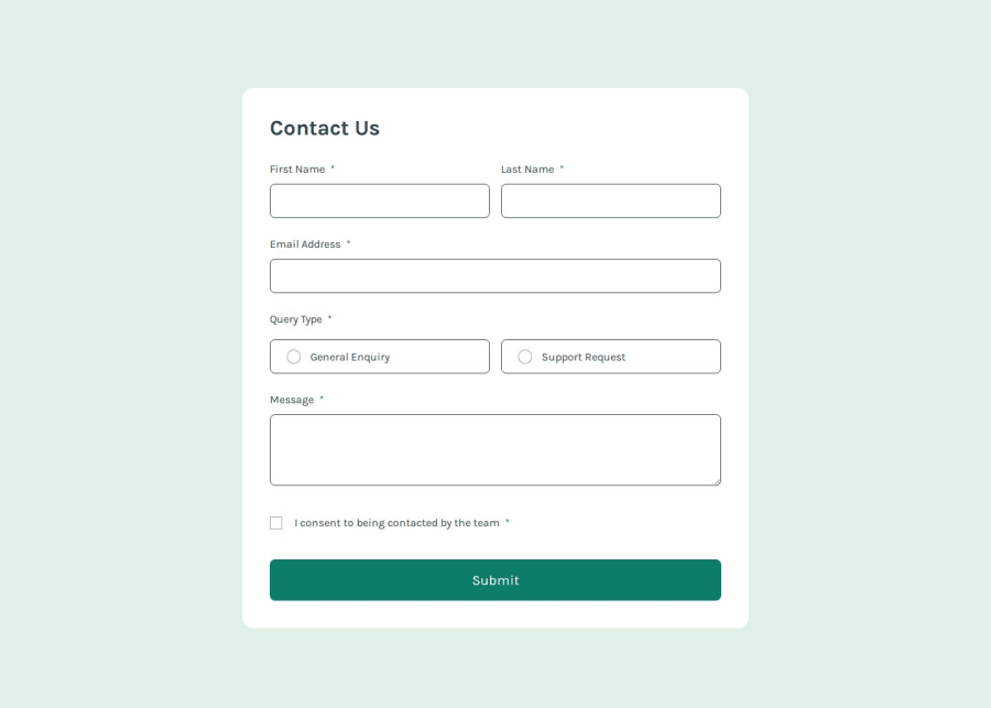
- styling checkbox and radio inputs while remaining their accessibility.
- built-in form validation. Some pitfalls:
- no "pattern" attribute on textarea elements.
- pseudo-class :out-of-range not applicable on scenario of text type with minlength and maxlength, only works on number type with min and max.
- first time styling a form as complicated as this one.
- some styling consideration on
if settingas grid. The legend width decreased but I still don't know why, and settingtext-wrap: no wrapcan somewhat make it work.
Aria-labels to let screen readers announce the error message were not yet learned and practiced, but maybe later.
Community feedback
- @gowthamjk08Posted 3 months ago
good try you are almost there but the form width is too big so it's looks little messy make more focus on next time!
0

Please log in to post a comment
Log in with GitHubJoin our Discord community
Join thousands of Frontend Mentor community members taking the challenges, sharing resources, helping each other, and chatting about all things front-end!
Join our Discord