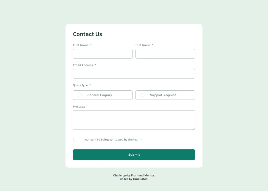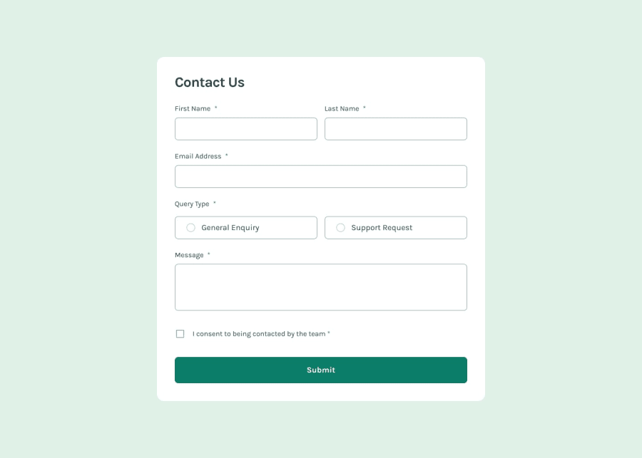
Design comparison
Solution retrospective
I struggled quite a bit with styling radio buttons and checkboxes, but after some research, I think I’ve figured it out. Other than that, I didn’t face many challenges. I realize now that I should plan and write the error messages in the initial HTML structure next time. Since I didn’t do that, I had to rewrite the code from scratch. Nevertheless, it was an enjoyable project. I’d appreciate any advice you can offer!
Community feedback
- @KapteynUniversePosted 4 months ago
Merhaba Tuna, good job. I was thinking about going back an redo this challenge, now looking back i did a poor job back then :D.
Since you wrote the method on the form; get is not correct, get is to request data from somewhere like an api, post is the one you should use. Post is to send data to a server to create/update a resource.
Fieldset is to group related elements in a form, i think you can remove fieldset around the queries and change query-type div to a fieldset, legend also should be a direct child of the fieldset so it will be corrected with this way too. If you want, you can also wrap fname,lname and e-mail with a fieldset too i think.
A little bug; because of the positioning of the custom checkbox it is not possible to uncheck the consent button, you have to click either the label or a little to the left to the white space.
You can easily change the radio and checkbox color with this. This kinda broke your radios in your code tho but checkbox works, might need to change somethings if you wanna use it
input[type="radio"]:checked,
input[type="checkbox"]:checked {
    accent-color: color;
}
This doesn't required if you have backend validation but i like frontend validations. You can put required attribute to the inputs, also autofocus to the first name for better accesibility. On a real page tho, contact forms usually be at the below of the page under other things, so autofocus might do harm than good in that scenario. There are also nice ways of styling the inputs and elements around them with frontend validation, for example it is possible to show error messages with CSS only. Ofc backend validation is very important.
For better accesibility i also recommend you to check aria labels. Forms are actually are more than they seem and great to learn accesibility.
Marked as helpful2P@tunaertenPosted 4 months ago@KapteynUniverse First of all, thank you for your explanations. Form elements are not very familiar to me; I’ve rarely used them before. That’s why I wrote my code by looking at examples on MDN or Stack Overflow. However, I can see that it’s not very correct. :) I will definitely remove the fieldsets and restructure the code. Similarly, I’ll fix the checkbox uncheck functionality, the input styling, and the aria-label. Can you share a link to an article, CodePen, or something similar about how to handle error messages using only CSS?
Thanks for your help 🙏
0@KapteynUniversePosted 4 months ago@tunaerten This is the way i like, you can change input style like this
input:not(:placeholder-shown):valid {
  border: 1px solid green;
  background-image: url(image path);
  background-position: 95%;
  background-repeat: no-repeat;
}

input:not(:placeholder-shown):invalid {
  border: 1px solid red;
  background-image: url(image path);
  background-position: 95%;
  background-repeat: no-repeat;
}
This works like; when user write something to the input, placeholder stops showing and style will be changed based on the input. You can also add a pattern on the HTML side, to email input for example and make the frontend and the backend validation synchronous.
A success and error icon also important because user might be color blind like protanopia or deuteranopia so they may see green and red same color.
About this part Kevin Powell has a video. In the video he tells about user-valid/invalid too, but i don't like it because it works after outfocusing the input instead of real time. Also browser support is not great at the moment i think.
Showing error images needs a bit aiming tho.
.error-msg {
display: none;
}
input:not(:placeholder-shown):invalid + .error-msg { display: block; }Like this or
input:not(:placeholder-shown):invalid ~ .error-msg {
  display: block;
}
like this you can show error message but error message should be adjacent or general sibling of that input.
I never saw any video or article about this part tho. Recently someone asked if this was possible to do it on this webpage and i can say partially i found it :D If you can make it more efficient don't forget to tell me
Also i don't have a coding background or experience on the field but i recently refactored one of my old solution, another form, you can check that if you want.
There are also seniors here, like Grace Snow, you can check her solution too. But again not this form
Marked as helpful0P@tunaertenPosted 4 months ago@KapteynUniverse Thank you! I’ll try out your suggestions right away and update my code.
1P@tunaertenPosted 4 months agoUpdate!
I made some changes to the code.
- I changed the form method from
GETtoPOST, - modified the styling of the inputs in a different way,
- fixed the bug where the
checkboxcould not beunchecked. - added some aria labels Thanks again for the help @KapteynUniverse !
1 - I changed the form method from
- @Samuel-501Posted 4 months ago
I also had some problems on grid display and also with the divs
0
Please log in to post a comment
Log in with GitHubJoin our Discord community
Join thousands of Frontend Mentor community members taking the challenges, sharing resources, helping each other, and chatting about all things front-end!
Join our Discord
