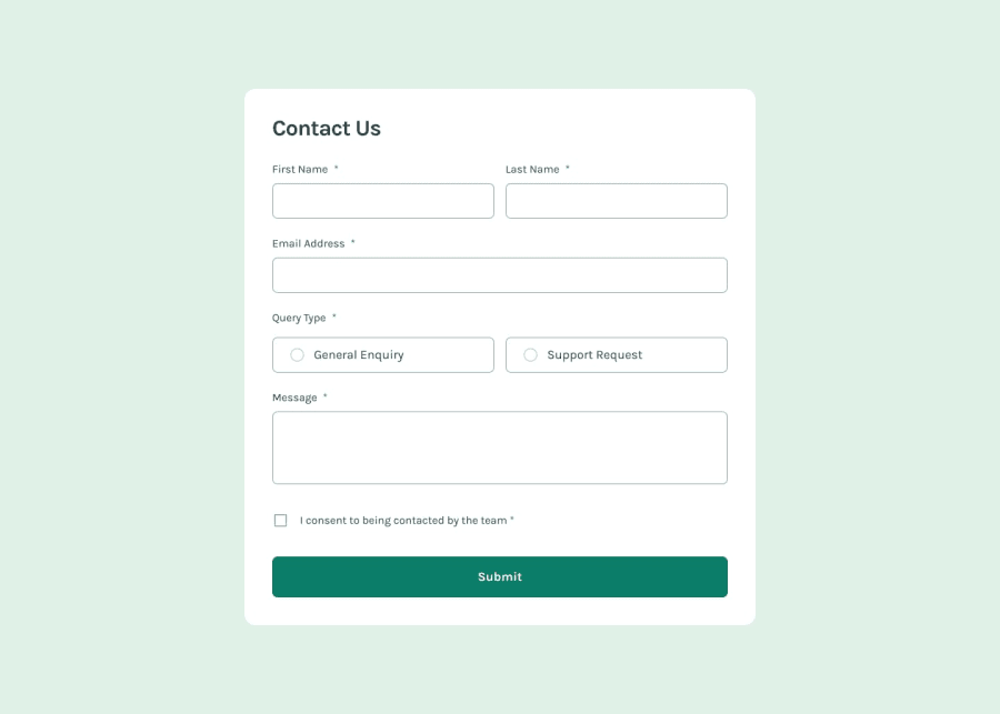
Design comparison
SolutionDesign
Community feedback
- @kaamiikPosted 3 months ago
Congratulations on completing this challenge!
- For the toast message, I suggest adding a timeout so it automatically disappears after a few seconds. This will create a smoother user experience.
- When the toast message appears, it seems to push the contact card down. It would be great to address this for a more seamless layout.
- Additionally, the input fields should have a red outline or border during error states to provide clearer visual feedback.
Other than that, it’s looking fantastic! Keep up the great work!
Marked as helpful0@Andro87Posted 3 months agoHi @kaamiik !
Thank you for your suggestions and your time!
Happy coding!
1
Please log in to post a comment
Log in with GitHubJoin our Discord community
Join thousands of Frontend Mentor community members taking the challenges, sharing resources, helping each other, and chatting about all things front-end!
Join our Discord
