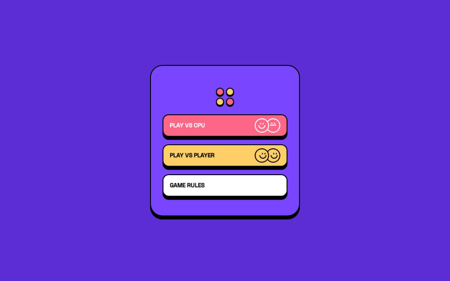
Connect 4 Game built with ReactJS


Design comparison

Solution retrospective
I am most proud of making the site responsive to different sized devices and the bonus challenge of making a cpu player to play against was a fun little challenge.
If I had to start over I would have made the site mobile first and responsive from the very start. Having the site originally be very hard coded with px values was annoying to go back and fix.
What challenges did you encounter, and how did you overcome them?I initially made the site just following the desktop design and did not make the site responsive at all. This was a mistake that once I decided to come back and try to implement the mobile design, it definitely made going back and fixing it a headache. The hardest part of the fix was the fact that the layouts of the desktop and mobile designs are different.
I had originally the html for the game page being this:
<div className="game-body">
  <div className="red-info">
    <PlayerInfo />
   </div>
   <GameBoard />
   <div className="yellow-info">
      <PlayerInfo />
    </div>
</div>
that works great for the desktop layout but with the two player infos needing to be on top of the board I could not get it to work. So my solution is using some conditional rendering based on the screen size. The mobile and tablet versions render this html that made the CSS so much easier to work with.
What specific areas of your project would you like help with?<div className="game-body"> <div className="info-row"> <PlayerInfo /> <PlayerInfo /> </div> <GameBoard/> </div>
Any and all help will be appreciated!
Community feedback
Please log in to post a comment
Log in with GitHub
Join our Discord community
Join thousands of Frontend Mentor community members taking the challenges, sharing resources, helping each other, and chatting about all things front-end!
Join our Discord