Design comparison
SolutionDesign
Solution retrospective
¿como te parece esta solucion?
Community feedback
- @realsalePosted over 2 years ago
Yo! Martin,
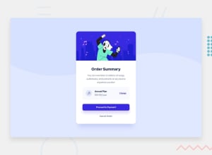
Great job man, it almost looks exactly the same, and you've manage to properly align your component.
For further enhancement you might consider:
- adjusting component dimension in both
widthandheight - make your main heading a little bigger
- using
margininstead of relying topaddingwhen aligning your details. - and um, use
<a>or<button>tag instead of<p>tag in cancel CTA, so the screen readers treats it as an important Call-To-Action rather that a normal text.
Goodluck man.
Marked as helpful0 - adjusting component dimension in both
Please log in to post a comment
Log in with GitHubJoin our Discord community
Join thousands of Frontend Mentor community members taking the challenges, sharing resources, helping each other, and chatting about all things front-end!
Join our Discord
