

Design comparison
SolutionDesign

Community feedback
- @Smith11bPosted 6 months ago
Layout looks great and looks like your semantic html is good as well.
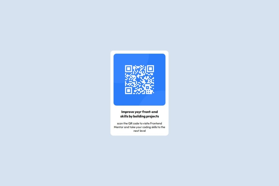
I would say the font sizing and coloring are off, (Both the header and the text are shades of blue, not black). The border radius and padding are also off a smidge and it looks like your forgot the border shadow on the card itself.
I understand what you're doing though and it looks clean. That's a great start.
Marked as helpful0@Davi-logPosted 6 months ago@Smith11b muito obrigado são coisas que não havia notado mas que agora tomarei mais cuidado ao realizar. terei mais atenção. também fui instruido de utilizar o figma para obter maiores dicas, você aconselha?
0

Please log in to post a comment
Log in with GitHubJoin our Discord community
Join thousands of Frontend Mentor community members taking the challenges, sharing resources, helping each other, and chatting about all things front-end!
Join our Discord