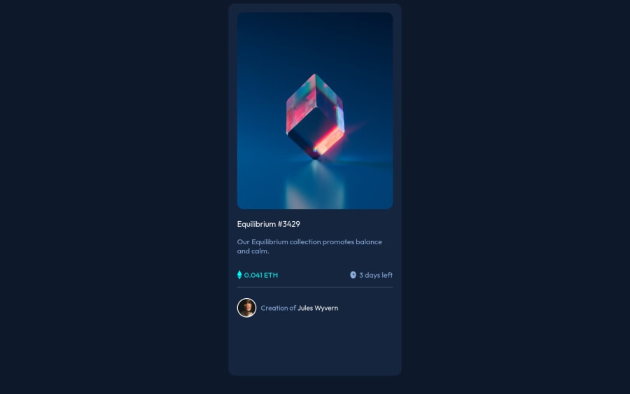
Submitted over 2 years ago
Componente de tarjeta de vista previa de NFT - Lincoln
@LincolnEulogio
Design comparison
SolutionDesign
Community feedback
- @denieldenPosted over 2 years ago
Hi Lincol, I took some time to look at your solution and you did a great job!
Also I have some tips for improving your code:
- add
maintag and wrap the card for Accessibility - remove
margin and heightfromcardclass and setmax-width: 20rem - try to use flexbox to the body for center the card. Read here -> best flex guide
- after, add
min-height: 100vhto body because Flexbox aligns child items to the size of the parent container - You can add the effect
:hovercreating adivthat appears on hover. I used tailwind but you can still see and understand which css properties you can use to do the same. Look here -> my solution - after, try to add a little
transitionon the element with hover effect
Overall you did well 😉
Hope this help and happy coding!
Marked as helpful0 - add
Please log in to post a comment
Log in with GitHubJoin our Discord community
Join thousands of Frontend Mentor community members taking the challenges, sharing resources, helping each other, and chatting about all things front-end!
Join our Discord
