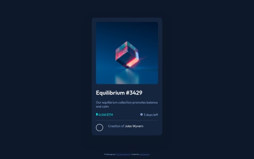
Component using -Semantic HTML5 markup and CSS custom properties

Solution retrospective
Note: I know it's not ideal, but I tried doing everything without flexbox or grid.
I wasn't able to get some items to align properly. Like the icon's, they appear a bit above the text. How can I fix that?
Also, the overlay image that appears on hover, when it does appear you can notice a slight gap at the bottom. Visible due to a difference in colour shades. How could I avoid or fix that in the future?
Getting the bases of the image avatar and the "Creation of ..." text to align was particularly difficult. Any tips?
Finally, the space between the elements stated above was difficult to set because depending on the size of the display the image may or may not fill its entire container (because of the border radius of 50%) causing an extra gap on the right. How does one go about tackling this issue?
Feel free to leave any other comments thanks!!
Please log in to post a comment
Log in with GitHubCommunity feedback
No feedback yet. Be the first to give feedback on obasekiosa's solution.
Join our Discord community
Join thousands of Frontend Mentor community members taking the challenges, sharing resources, helping each other, and chatting about all things front-end!
Join our Discord