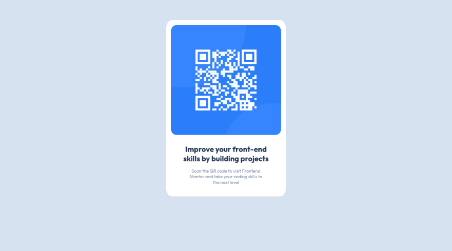
Design comparison
SolutionDesign
Solution retrospective
If possible, send feedback on possible adjustments and improvements to this project.
Community feedback
- @tan911Posted almost 2 years ago
Hello, @WillieSantos. maybe this will improve your code:
- Try to wrap your content with a "main" element or put a "role" attribute with the value of "main" of your div element for accessibility purposes, so it should look like this: <div role="main" class="block"></div>.
- use "rem" instead of "px" for font size, so your audience can be able to see the text base on their preferred font-size.
Hope it helps, Thanks.
Marked as helpful0 - @HassiaiPosted almost 2 years ago
In the html use the main tag instead of a div with a class block. There is no need to give the image a dive and put all the text-content in one div:
<main><img><div><h1></h1><p></p></div></main> To center a content on a page, add min-height: 100vh to the body instead of .block, use main. Give it a width value and a padding value there is no need for display: flex; and its properties in the main. There is no need to declare a margin value for the main. Give the img a max-width of 100% and a border-radius value , there is no need for the margin value the padding value in the main will take care of that. give the div for the text-content a padding top and bottom value . Use rem and em as unit for the margin, padding a width value. preferably use rem as a unit for your font size , by default 1em or rem = 16px; Hope am helpful HAPPY CODINNGMarked as helpful0
Please log in to post a comment
Log in with GitHubJoin our Discord community
Join thousands of Frontend Mentor community members taking the challenges, sharing resources, helping each other, and chatting about all things front-end!
Join our Discord
