Submitted almost 4 years ago
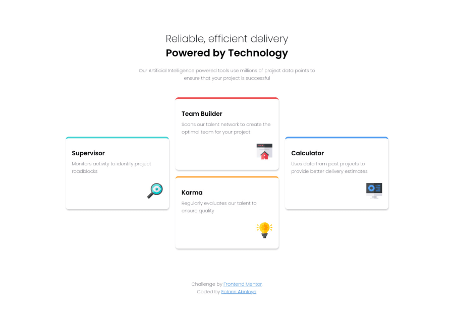
Component Design Using CSS Grid, SCSS, & Flexbox
@folathecoder
Design comparison
SolutionDesign
Solution retrospective
Any feedback will be awesome. Check my code!
Community feedback
- @SzymonRojekPosted almost 4 years ago
Hi Folarin,
Very nice RWD! :D
I have checked your HTML structure, a few tips for you:
- for this top text I suggest to use the header tag;
- this is a single page component so I think the main content will be below the header => the main tag will be here very useful, what do you think?
- section tag: also possibly there is another solution, main tag as a wrap for all content (header and section below with three divs);
- h1, I don't recommend to use br tag (only when this is really needed but in this solution is not). You can use h1 with two spans inside of it (main-heading and sub-heading);
- alt text => in this project, icons have only decorative role - that's a reason why alt text should be provided as a empty (alt="") so these icons can be ignored by assistive technologies, such as screen readers;
- I would recommend to use min-width instead of max-width;
Generally, good job => keep going! That's it from me.
Ps. Don't forget to upvote any comments on here that you find helpful.
Greetings :D
1 - @folathecoderPosted almost 4 years ago
Thank you very much! You just helped me improve! I will work on them! 👍
0@SzymonRojekPosted almost 4 years ago@folathecoder
Great. Last time I was reading about the br tag. Sometimes I use it so generally I want to be aware when it is a good occasion to implement it. Have read this discussion => link.
Have a good time! :D
0
Please log in to post a comment
Log in with GitHubJoin our Discord community
Join thousands of Frontend Mentor community members taking the challenges, sharing resources, helping each other, and chatting about all things front-end!
Join our Discord
