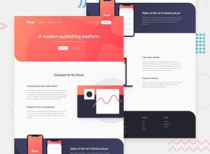
Design comparison
Solution retrospective
This was my second challenge in the Junior category. Took a lot of time to complete this challenge but was surely a learning experience. I had faced a few issues on this one:
-
At times the styling on one element can drastically affect the elements around it, which becomes difficult to handle, especially when trying to make the page responsive.
-
what would be the best way to make the images responsive and still not let them affect the page's layout? on this project, the images sometimes take absurd dimensions which would affect the layout of my page.
-
Lastly, right now the login and signup button on the top right keeps moving down when I open my menu on the left. I tried setting it to float: right, but it doesn't work.
Also, I feel I need to take a modular approach to each section of the page so that my final sass file is not too big. Are there any models that I can follow to implement the design in a modular manner?
Any feedback would be appreciated.
Community feedback
- @jesse10930Posted over 3 years ago
Hey Abhishek! Great job on the project, looking good so far!
As to your third question, adding the styling 'align-self: flex-start;' to the 'nav-login' class should fix that problem. Right now, the div is centered because of the styling 'align-items: center;' on the 'nav-menu' class. When the dropdown on the left opens, the parent div becomes larger. Then the 'nav-login' div moves to the center of that larger div. If you add the align-self attribute, the div will be unaffected by the size of its parent div.
Hope this helps!
Marked as helpful0@abhisheksinghwork7Posted over 3 years ago@jesse10930 Thanks for the solution. I missed the along-items: center on the parent div.
1
Please log in to post a comment
Log in with GitHubJoin our Discord community
Join thousands of Frontend Mentor community members taking the challenges, sharing resources, helping each other, and chatting about all things front-end!
Join our Discord
