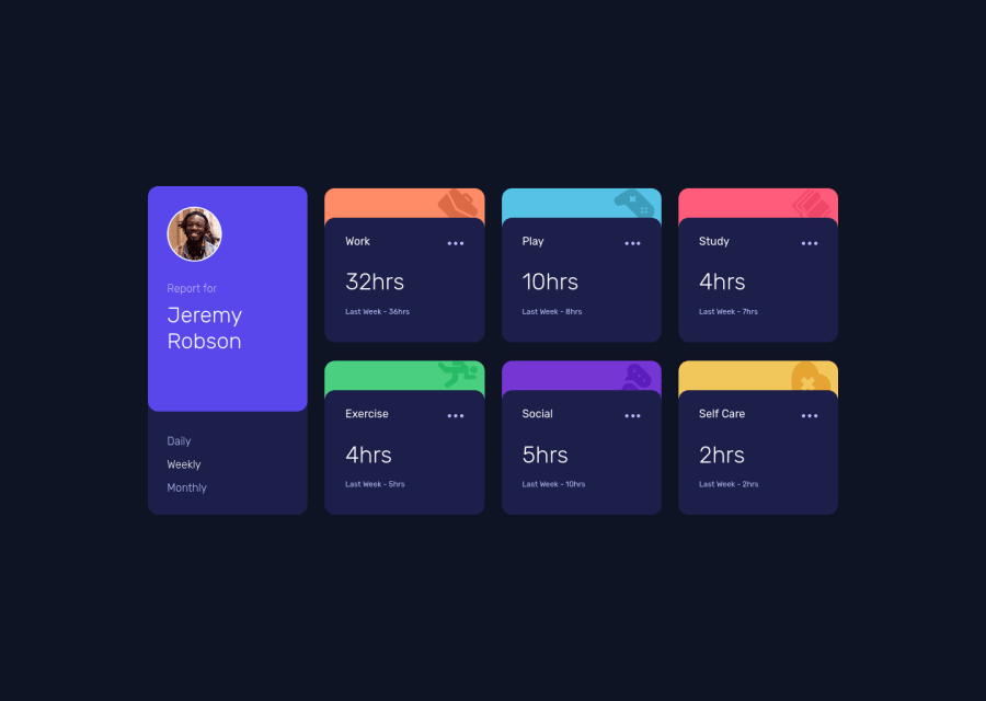
Design comparison
SolutionDesign
Solution retrospective
Comments Please, where do you think I can improve ?
Community feedback
- @ruona88Posted over 3 years ago
This is the most detailed review of my work ever, thanks.
0 - @pikapikamartPosted over 3 years ago
Hey, great work on this one. Layout in desktop looks great, it is responsive and the mobile state looks great as well.
Some suggestions would be:
- First, there is an error in the console, you might want to check that one out.
- Right now, your
bodytag has noheightbecause it's direct child themainis usingposition: absolute. Avoid usingposition: absoluteon a large element since it makes the element out of the flow. If you are just centering it, remove thepositionprops and on thebodyjust add:
align-items: center; display: flex; flex-direction: column; justify-content: center; min-height: 100vh;- It would be better if the left-side part of the layout are both being wrapped in a parent
divand the right-side which contains the 6 cards are wrapped as well on their own parent element so that your markup will be more clearer since elements are isolated on their own. - A page must have a single
h1on a page. Since there are no text-content that are visible that could beh1, you will make theh1screen-reader only text. Meaning this will be hidden for sighted users and only be visible for screen-reader users, search aboutsr-onlystylings and see how it is used. Theh1text should describe what is the main content is all about, thish1would be placed as the first text-content inside themainelement. - Person's
imgshould be using the person's name as thealtlikealt="Jeremy Robson". A component like this when a person's name and image are both present, use the person's name as the value as it is a meaningful image. - Name of the person could use a heading tag.
- Those list of selections shouldn't use a link
atag because those aren't links, usebuttoninstead because it is a control. But usingbuttonalone is not accessible that is why you need to make use ofaria-liveelement that announces a certain selection is selected and what could be the changes made. You could make use of radio buttons as well on this since it is a selection and radio buttons are great for those. This will be inside afieldsetalong with a screen-reader onlylegendthat describes what is the purpose of those set of radio buttons. - Each card title like
workcould use a heading tag since it gives overview on what the section would contain. - I think there is an
svgfor the 3 dots, better using it than creating extra html elements.
Aside from those, great work again on this one.
0
Please log in to post a comment
Log in with GitHubJoin our Discord community
Join thousands of Frontend Mentor community members taking the challenges, sharing resources, helping each other, and chatting about all things front-end!
Join our Discord
