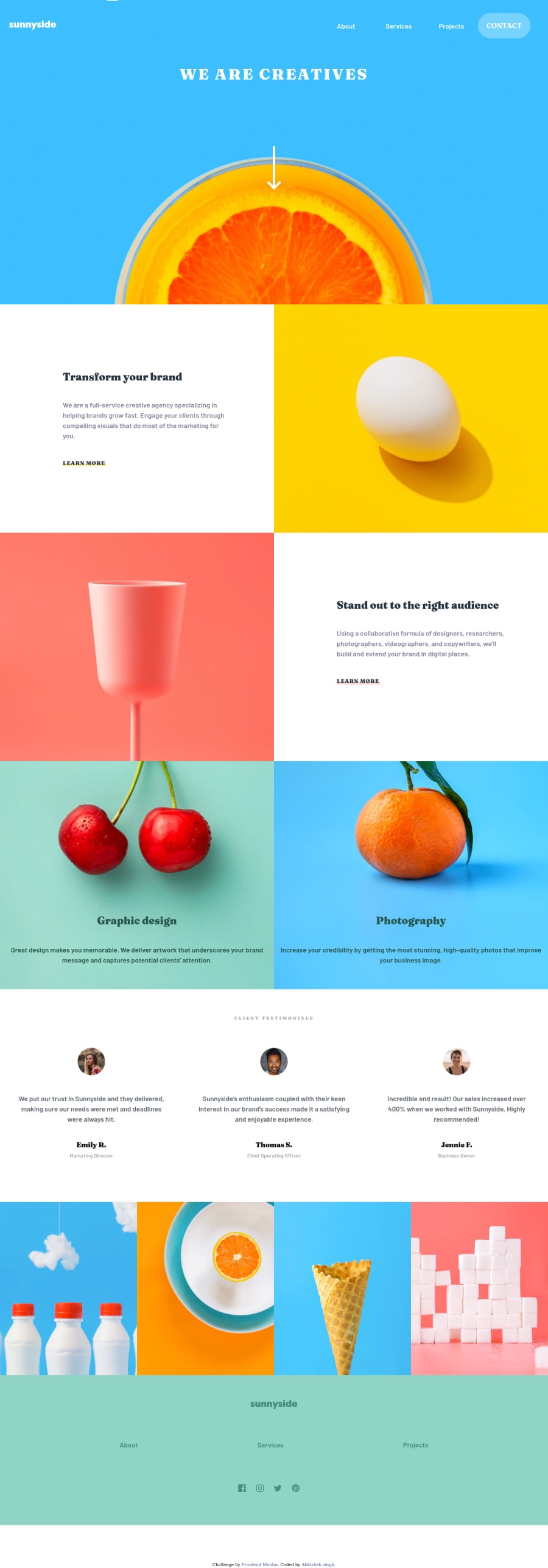


Design comparison

Solution retrospective
Hey guys! This was my first Junior level challenge. It was a great experience. Just wanted to ask few things:
-
While rearranging sections or divs from mobile version to desktop version What is the best method to go about it? Should we strictly use the margins and paddings from the design image OR rely on the auto resizing from flex and grid to just put things in place.
-
While placing an image is it better to use the picture tag in HTML which changes the image according to the media width or should we place the image using CSS for mobile and desktop versions separately?
Any feedback would be appreciated. Thanks
Community feedback
Please log in to post a comment
Log in with GitHub
Join our Discord community
Join thousands of Frontend Mentor community members taking the challenges, sharing resources, helping each other, and chatting about all things front-end!
Join our Discord