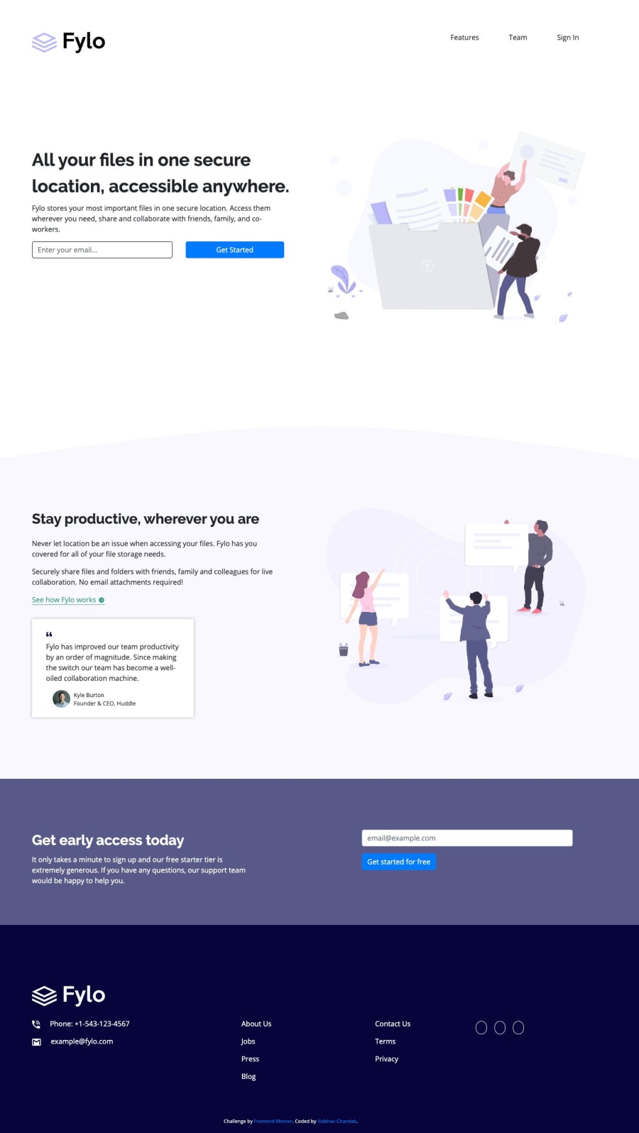
Completed Using Atom (HTML, CSS and Bootstrap)
Design comparison
Solution retrospective
I somehow managed to create the design for both desktop and mobile but I think the code I wrote for this solution is very bad(poor). How can I improve that?
Community feedback
- @AlexBueckigPosted about 5 years ago
Hi Vaibhav,
one thing I'd advise you is to have a look at HTML5 semantic elements. They greatly improve accessibility (for both search engines and screen readers) and make your markup easier to understand for everyone. ;)
3@Ritesh1432Posted about 4 years ago@AlexBueckig They also help the search engines to retrieve information faster
0 - @argelomnesPosted about 5 years ago
Hey Vaibhav,
That's fine. You'll improve as time goes by if you keep coding. I suggest moving your scripts to the bottom, before
</body>. This is to improve page load time. Sticking tomin-widthonly is less of a headache for me. Give it a try on your next challenge.Good job!
2@Vaibhav-chandakPosted about 5 years ago@argelomnes Ok Thank you for the suggestion. I didn't understood your min-width point.
0@mattstuddertPosted about 5 years ago@Vaibhav121121 Argel is suggesting you try using
min-widthmedia queries instead ofmax-width. They're great, as you typically end up writing less code and they also have the benefit of loading in fewer styles for your mobile users.Here's a great run-through of responsive on Interneting is Hard, which goes into this mobile-first approach if you're interested.
1
Please log in to post a comment
Log in with GitHubJoin our Discord community
Join thousands of Frontend Mentor community members taking the challenges, sharing resources, helping each other, and chatting about all things front-end!
Join our Discord
