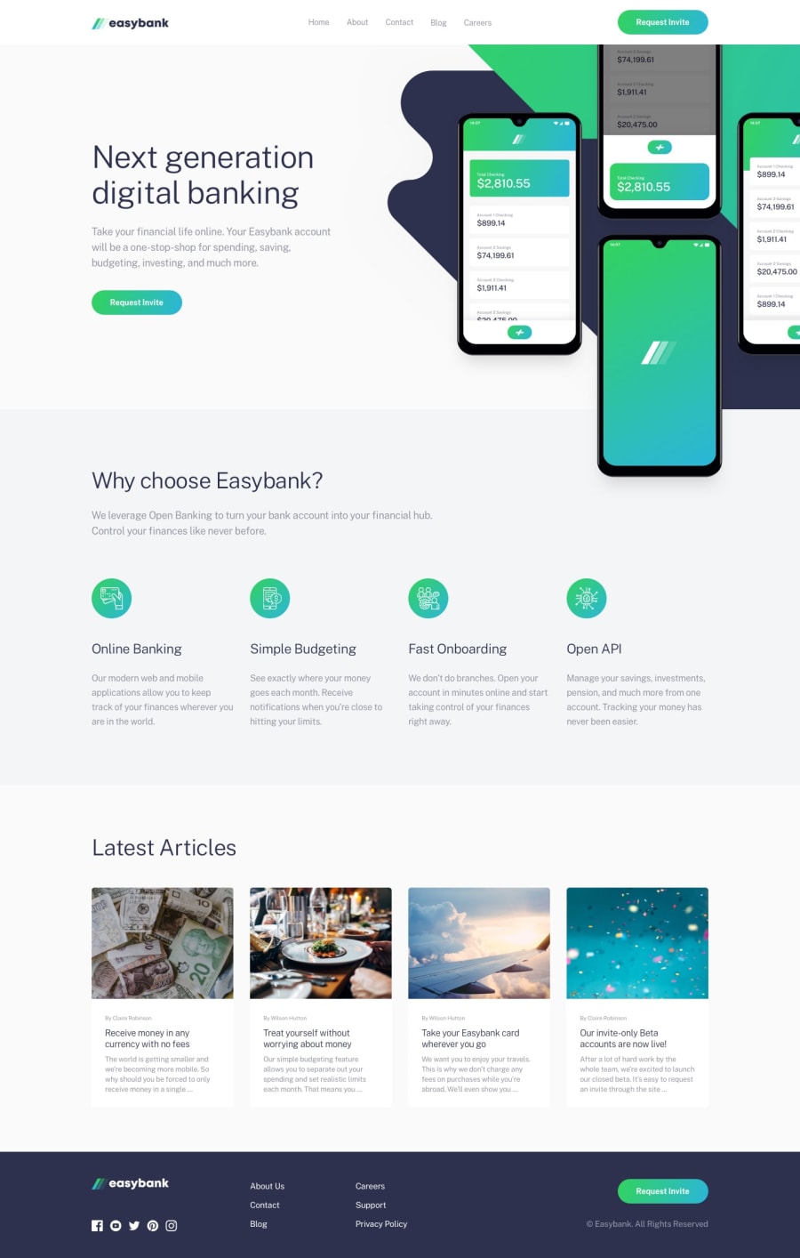
Completed it | Fully Responsive | But Some Mistakes :-(
Design comparison
Solution retrospective
tips regarding which icons should we use , svg or font-icons
Community feedback
- @TropicolXPosted over 3 years ago
Use svg if it is provided in the ui design. If it isn't or it's a personal project, you can use font icons from places like font awesome, bootstrap icons etc
Marked as helpful0 - @A-amonPosted over 3 years ago
Hello! Great work~
I have a few suggestions:
-
Seems like you set the width to 1100px hence, causing navbar until "Why choose easybank" section's backgrounds to not be 100% width.
-
You have .backg and .frontg empty divs just to set background images. I think only having .right would have been enough. By doing this, some alternatives would be using before/after selector or setting the background images one over the other. (Don't take my word for this though. It might not work~ 😅)
-
Use button tag for the hamburger toggle.
-
Wrap navbar links, social media icons and footer links in a tags. (You probably don't wanna leave .soc-links items empty. Put the purpose of it e.g. Facebook then hide the text using CSS. )
-
Just a personal preference probably, but the menu animation on mobile size takes a little too long to appear. (It looks amazing tho! 😀)
Marked as helpful0 -
- @hemakumarm72Posted over 3 years ago
div header inside the container div after solved problem
0 - @hemakumarm72Posted over 3 years ago
div header inside the container div after solved problem
0
Please log in to post a comment
Log in with GitHubJoin our Discord community
Join thousands of Frontend Mentor community members taking the challenges, sharing resources, helping each other, and chatting about all things front-end!
Join our Discord
