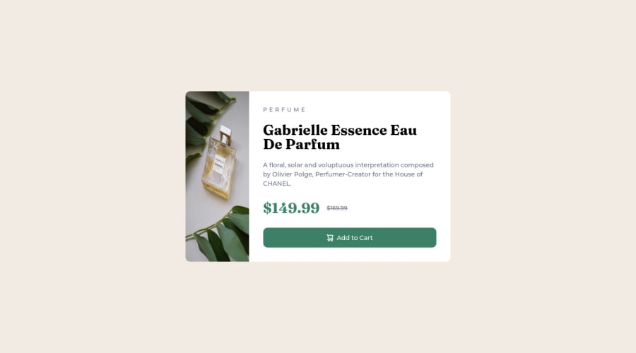
Not Found
Not Found
Not Found
Not Found
Not Found
Not Found
Not Found
Not Found
Not Found
Not Found
Not Found
Not Found
Not Found
Not Found
Not Found
Not Found
Not Found
Not Found
Not Found
Not Found

Submitted

Complete solution using bare HTML and CSS

@prchristie

Desktop design screenshot for the Product preview card component coding challenge

This is a solution for...

  • HTML
  • CSS
1newbie
View challenge

Design comparison


SolutionDesign

Solution retrospective


The most difficult thing here was centering the product card on the body itself. Honestly, centering anything is really difficult because CSS seems to have so many different properties relating to it. I went with

body {
  display: grid;
  place-content: center;
}

and I honestly couldn't tell you why this works.

I have found that to center something, you need to add properties to its parent. Is this generally true? IE for the product card, I can't add a css property to the card itself

.product-card {
  my-centering-code
}

as this seems to only center its content, not the element inside of its own container.

Community feedback

Riley 260

@rileydevdzn

Posted

Hi! Congrats on completing the product preview card!

You're right, there are a TON of ways to center things in CSS. In answer to your question, how to center items depends on whether you're trying to center a block-level element like a <div> or an inline-level element like a <span>.

Here's a reference on centering in CSS that might help, it gives specific examples of what you want to center and what properties to use to do that.

It's generally better practice to avoid putting too much styling on your <body> element. Looking at your code, one thing you can do is add a <main> element between your body and article elements. It's a semantic element, containing the main topic or content of the page and also helps assistive devices with navigation (as a landmark). And you can apply the CSS styling to the main element instead of the body, so win-win 😊

I'll use Flexbox in my example, a lot of people find it easier with flow in 1 dimension, versus Grid's 2 dimensions. But you'll see solutions with both Flebox and Grid. For centering the single card (block-level element) inside the main (parent) element with Flexbox, like this:

main {
  height: 100vh;
  display: flex;
  align-items: center;
  justify-content: center;
}

First, we're setting the height of the main element to be equal to the height of the viewport, or 100vh. Next, we're setting the layout to Flexbox, then using the last two properties to center the card horizontally and vertically. Flexbox is slightly different from Grid here because in Flexbox you can decide which direction (horizontal rows or vertical columns) you want the content to flow, so you'll see references to the "main-axis" and "cross-axis". The default direction is horizontal (since I didn't specify flex-direction in the above code, it's using the default). Here's a Guide to Flexbox so you can see the various properties all in one place.

As to why your code worked, here's a Guide to Grid that does a good job explaining what the properties are and how they work. You'll find an explanation of place-content toward the bottom of the page (~3/4 of the way down) on the left-side.

You did a great job using semantic elements and global variables in this build! One thing I'd suggest here is turning your h2 into an <h1>. You were spot on with where to put it, just bump it up one level, since every page needs one h1 element (just like every page should have one main element) explaining what the page is about.

There's a lot here but I've found those references pretty useful for builds. Hopefully this helps and happy coding!

Marked as helpful

1

@prchristie

Posted

@rileydevdzn Omg thank you so much for the feedback. This was my first time ever really using css after doing a bit of self study so this took me a long time. I am a backend engineer by trade so its been a big learning curve :p . I started off with the FullStackOpen course but found immediately that I had no ability to style things and I had such a lack of fundamental knowledge that I was just overwhelmed with it.

So once again, thanks for the help! I'll make sure to incorporate all this excellent advice :)

0
Riley 260

@rileydevdzn

Posted

Hey @prchristie!

You did great! There's soooo much in CSS, it can be really overwhelming.

Also check out freeCodeCamp's Responsive Web Design course. It has a good introduction to styling with walk-throughs of CSS fundamentals (including the box model, Flexbox and Grid). The certification projects are optional (feel free to dig into them if you like but you can jump around the courses too) and the curriculum includes a bunch of mini-projects that you build along the way you might find helpful if you learn by doing (I certainly do). The city skyline and penguin builds were my favorites 😊

Happy coding!

0

Please log in to post a comment

Log in with GitHub
Discord logo

Join our Discord community

Join thousands of Frontend Mentor community members taking the challenges, sharing resources, helping each other, and chatting about all things front-end!

Join our Discord