Design comparison
Community feedback
- @cristianccggPosted 11 months ago
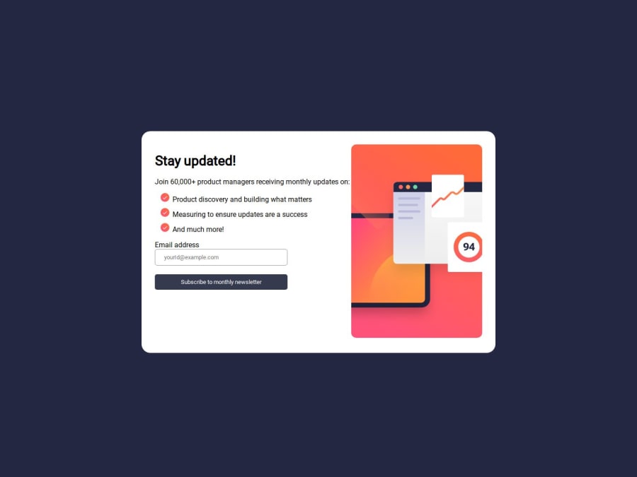
Hi @backdfb. Your design looks great. Maybe a bit of a gap between the left and the right container would be good, and you can use justify-content with display flex so the elements on the left container can be justified with the same space between each other and fill the whole container. The javascript seems to work but there are missing a couple of things to complete what the challenge is asking for. You can apply the same or similar code to the "dismiss" button which is suppose to close the "Thanks message" and send you back to the main page. The "thanks" messsage should also show the email that the user registered and that can be done by using innerText property. You are doing a great job and the design is very good!
0
Please log in to post a comment
Log in with GitHubJoin our Discord community
Join thousands of Frontend Mentor community members taking the challenges, sharing resources, helping each other, and chatting about all things front-end!
Join our Discord
