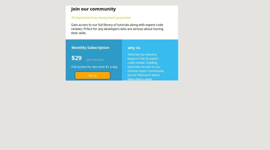
Design comparison
Community feedback
- @Code-BeakerPosted 7 months ago
Hi there, congratulations on completing this challenge! You've done a great work on this one! 🎉
I have some suggestions regarding your project that might help you improve it:
- this project lets you work with your CSS grid layout skills. As far as I could understand, you've used three separate rectangles with margins and paddings to join them together. If you're struggling with the grid, I recommend you to go through these resources:
- Kevin Powell's tutorial on CSS grid
- MDN Documentation
Other recommendations:
-
use an external stylesheet instead of placing your CSS inside the html file. It is recommended when approaching projects like this and bigger projects as well.
-
don't use percentages for margins because they're hard to maintain:
don't do this:
margin: 24%;instead, use
rem:margin: 2rem; /* change this value */- use better class names. It is recommended to give
classto elements that describe what they're for example,
when you have a navigation bar with a
<nav>element, use a class name like<nav class="navbar"></nav>it gives you a better idea about the element.
- to center the card both vertically and horizontally, you can give the body a flex and then center them like so:
body {
display: flex;
justify-content: center;
align-items: center;
min-height: 100vh;
my personal recommendation is to avoid using this on the
bodyitself and instead use amainor adivelement.- use Google Fonts to import the fonts that are required in this project.
Hope this is helpful to you 😃
Marked as helpful0
Please log in to post a comment
Log in with GitHubJoin our Discord community
Join thousands of Frontend Mentor community members taking the challenges, sharing resources, helping each other, and chatting about all things front-end!
Join our Discord
