Design comparison
SolutionDesign
Solution retrospective
feedback please
Community feedback
- @harika09Posted almost 4 years ago
Nice work with this. I will just add some recommendation.
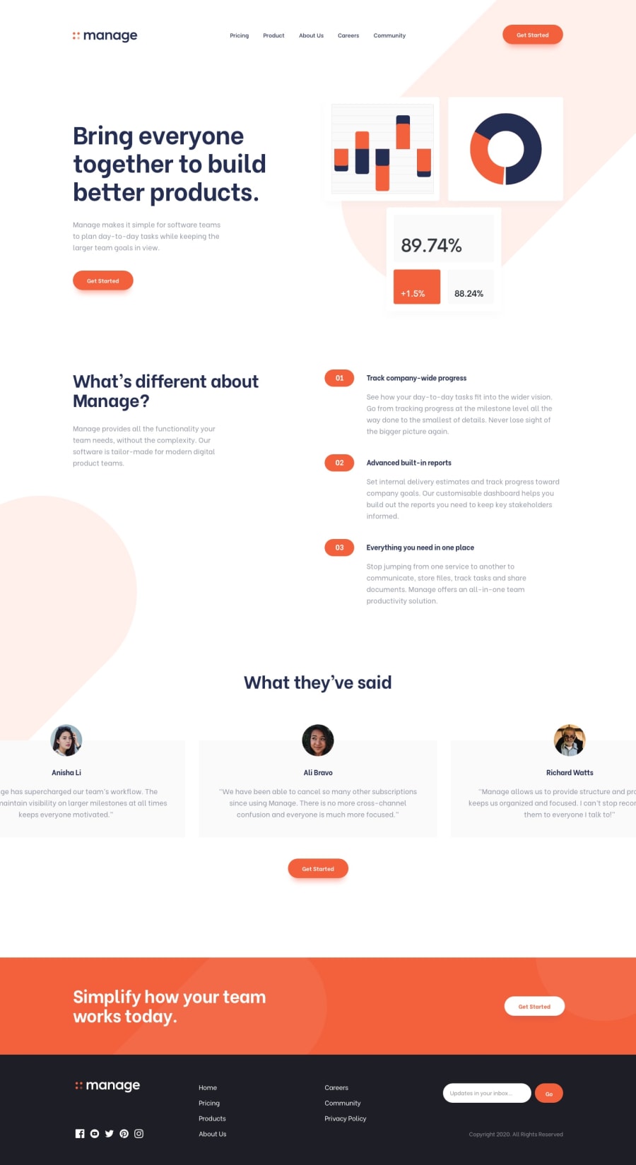
- try to center the illustration-img to center with it its max-with: 900px
- try to center to footer just like the design.
Happy Coding!
0@irfan-fauziPosted almost 4 years ago@harika09 thanks for your advice, i will fix it
0 - @MasterDev333Posted almost 4 years ago
Great work @Irfan fauzi. Some suggestions here.
- logo button and links should be anchor tags.
- h1 tag should be only one entire page.
- it would be great if you add active state to slider
- add transitions to buttons will make it more flexible. Overall, great! Hope it helps and happy coding~ :)
0@irfan-fauziPosted almost 4 years ago@MasterDev333 thanks for your advice, i will fix it
0 - @abhik-bPosted almost 4 years ago
Hi Irfan , Your solution is awesome and the testimonial slider is just 🔥, Its responsive and it seems amazing.
One opinion I might give is add
cursor : pointerto navbar links and button.Good job on this challenge , Keep it up 💯
0
Please log in to post a comment
Log in with GitHubJoin our Discord community
Join thousands of Frontend Mentor community members taking the challenges, sharing resources, helping each other, and chatting about all things front-end!
Join our Discord
