Submitted 10 months ago
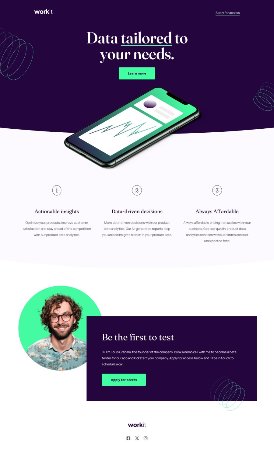
Company landing page using vanilla HTML & CSS
@isabella-lizarde
Design comparison
SolutionDesign
Solution retrospective
What are you most proud of, and what would you do differently next time?
I'm overall happy with the responsive layout and that I was able to strengthen my skills using vanilla HTML to correctly structure a webpage and practice using logical properties in CSS.
What challenges did you encounter, and how did you overcome them?The curved backgrounds are what gave me the most trouble, I ended up using clip-path: ellipse() which worked well. I also ran into some issues with the elements that required overlapping while maintaining a responsive layout.
What specific areas of your project would you like help with?Any feedback would be appreciated!
Community feedback
Please log in to post a comment
Log in with GitHubJoin our Discord community
Join thousands of Frontend Mentor community members taking the challenges, sharing resources, helping each other, and chatting about all things front-end!
Join our Discord
