

Design comparison

Solution retrospective
Manejando JavaScript cada día mejor! 💪
Community feedback
- P@jayco01Posted about 1 month ago
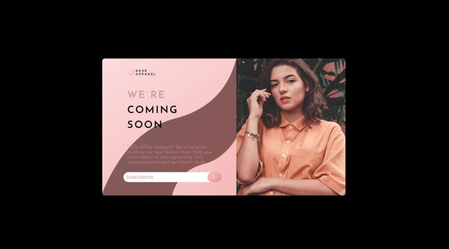
I really like the creative approach you took with the design! It’s cool to see a unique take on the layout. One thing I’d suggest is tweaking the background color since the black feels a bit harsh against the softer tones of the newsletter card. Maybe something more earthy would balance it out better. Also, the text color blends in a bit with the card, so adding more contrast could really help make the text pop and improve readability.
On the functionality side, I noticed the form validation isn’t quite working as expected. Even when I entered a valid email, it still showed an error. It might be because the validation is checking for an exact match. You could try using a regex pattern to check for a valid email format instead. Overall though, great job! A few small tweaks and it’ll be even better.
0

Please log in to post a comment
Log in with GitHubJoin our Discord community
Join thousands of Frontend Mentor community members taking the challenges, sharing resources, helping each other, and chatting about all things front-end!
Join our Discord