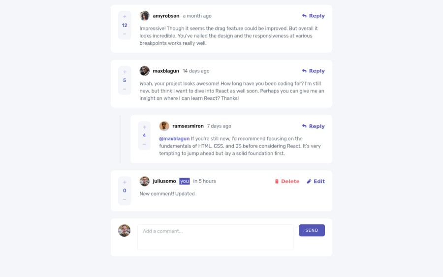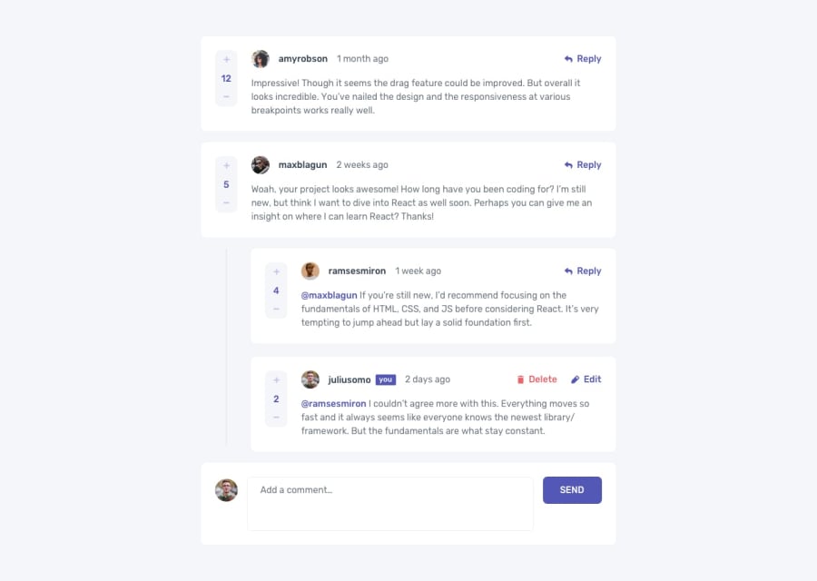
Design comparison
SolutionDesign
Solution retrospective
It was a fun and difficult challenge for me, I enjoyed practicing React with Redux. Feel free to point out my mistakes. Also I'm a little unsure with my Comment component, I'll be happy if you give me tips on optimization.
Community feedback
- @denieldenPosted over 2 years ago
Hi Andrew, great work on this challenge! 😉
Here are a few tips for improve your code:
- if I click on the upvote
buttonI can increase it to infinity and not just by 1 point. add a control - add
maintag and wrap the card for improve the Accessibility - remove all
marginfrommainclass - use flexbox to the body to center the card. Read here -> best flex guide
- after, add
min-height: 100vhto body because Flexbox aligns child items to the size of the parent container
Overall you did well 😁 Hope this help!
Marked as helpful1 - if I click on the upvote
- @besttlookkPosted over 2 years ago
Just wrote a comment on your live page... :p Great work.
#happCoding
1
Please log in to post a comment
Log in with GitHubJoin our Discord community
Join thousands of Frontend Mentor community members taking the challenges, sharing resources, helping each other, and chatting about all things front-end!
Join our Discord
