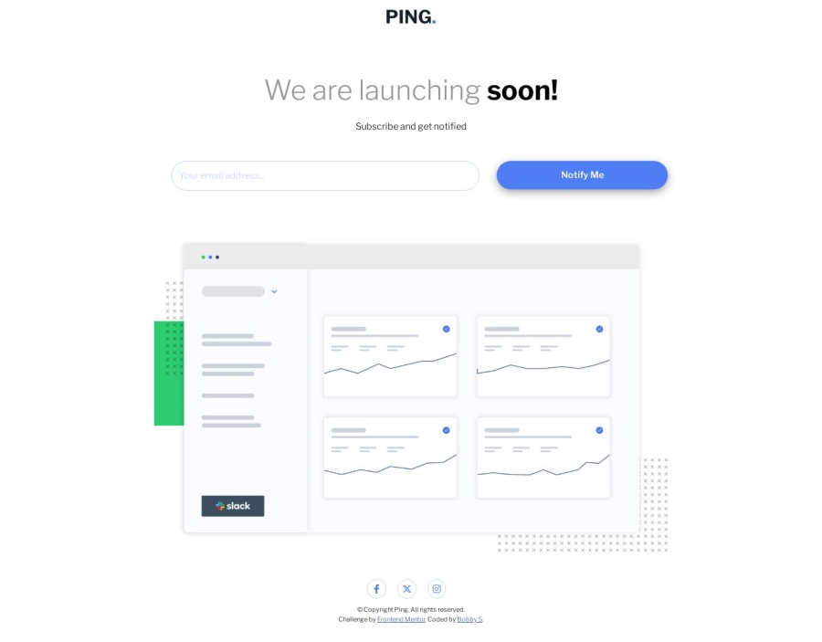
Design comparison
SolutionDesign
Solution retrospective
there were some layout issues with this one. Particularly with the error message in desktop and mobile. I am unsure of the javascript and always wonder if there is uneasier way, but what I have used works. I think next time I will follow the font size in the styling guide and incorporate a dark mode too!
Community feedback
Please log in to post a comment
Log in with GitHubJoin our Discord community
Join thousands of Frontend Mentor community members taking the challenges, sharing resources, helping each other, and chatting about all things front-end!
Join our Discord
