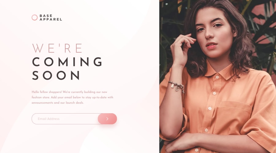
Design comparison
Solution retrospective
Feedbacks are welcome !!
🤘🤘🤘
Community feedback
- P@joelsalmeidaPosted almost 4 years ago
Hi David. You were really true to the original design.
I also liked the responsive solution. So smooth. Good work.
Marked as helpful0 - @bishalmallickPosted almost 4 years ago
Your work is very nice... but was it necessary to add a media query breakpoint two times???
0@DavidMaillardPosted almost 4 years ago@bishalmallick Hi Bishal, I think it is not necessary, I made it more by confort.
My reflection is, on the mobile view, I find it more elegant to keep proportions of the image to keep it mind the apparel product but at 900px wide, the image take a place too large on the screen. So I wanted to keep the split screen a little bit longer.
I am agree with you, it is debatable :)
0@bishalmallickPosted almost 4 years ago@DavidMaillard went through your code... Your idea did work... I only used one breakpoint... and it did kinda work for me... go through my solution which I submitted & give your review... i would like to hear your insights...
0
Please log in to post a comment
Log in with GitHubJoin our Discord community
Join thousands of Frontend Mentor community members taking the challenges, sharing resources, helping each other, and chatting about all things front-end!
Join our Discord
