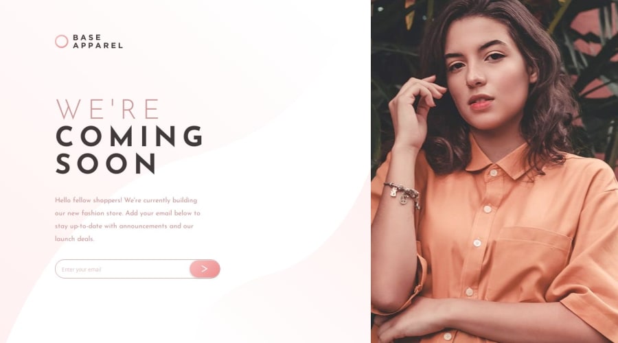
Design comparison
Solution retrospective
I am most proud of how quickly I was able to create a clean and functional desktop UI for the project. I focused on ensuring that the fonts and overall design were visually appealing and aligned with the specifications. The process of implementing the layout, responsiveness, and design elements such as the input field and arrow icon was smooth, and I was able to meet the requirements in a short time frame.
As for what I would do differently next time, I would aim to further optimize the mobile responsiveness to ensure the design looks even better on smaller devices. While it is functional, I believe I could improve the user experience on mobile by fine-tuning certain elements and reducing unnecessary padding or margin.
What challenges did you encounter, and how did you overcome them?One of the challenges I encountered was ensuring that the background image displayed properly across different screen sizes, especially on mobile devices. The image needed to be both full-width and aesthetically pleasing without being cropped too much, while also making sure the height wasn't too large and the image didn't get cut off inappropriately.
To overcome this, I used CSS techniques like object-fit: cover and adjusted the object-position to control how the image was displayed. On smaller screens, I made sure the image's aspect ratio was respected by carefully setting object-position: top to keep the most important part of the image visible. Additionally, I ensured that the image container's height was manageable and adjusted the layout to accommodate the image without compromising the user experience.
I'd like help with refining the image layout, especially ensuring that the images scale well and remain visually appealing across different screen sizes. While I've made progress in setting the image to be responsive using CSS techniques like object-fit: cover and object-position: top, there are still some areas where the image might not appear as intended on certain screen resolutions or aspect ratios. I would appreciate suggestions on how to make the image layout more adaptable and ensure that it doesn't get cropped or distorted on smaller devices.
Community feedback
Please log in to post a comment
Log in with GitHubJoin our Discord community
Join thousands of Frontend Mentor community members taking the challenges, sharing resources, helping each other, and chatting about all things front-end!
Join our Discord
