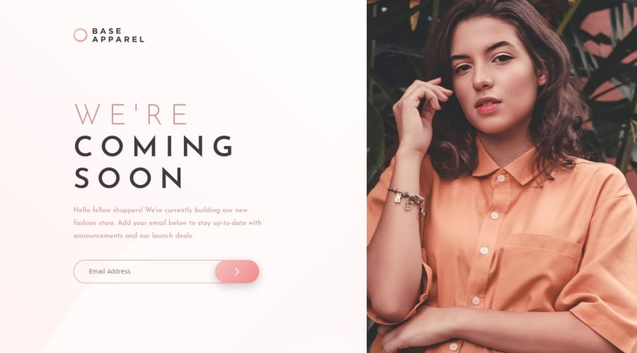
Design comparison
SolutionDesign
Solution retrospective
Appreciate any and all comments
Community feedback
- @afrusselPosted over 3 years ago
Nice work. So close to design.
2@DarkAmdHaPosted over 3 years ago@afrussel Thanks, I decided to make at least one pixel perfect challenge.
1 - @ChamuMutezvaPosted over 3 years ago
- avoid repeating content - use css to position elements in their proper place according to device size. That is in reference to the logo, see how best you can write you content to avoid a great shift between devices.
- input elements must be associated with a label.
<input type="text" name='email' placeholder ='Email Address' class='email'>
Happy coding
0@DarkAmdHaPosted over 3 years ago@ChamuMutezva You're absolutely right I was just a bit too lazy by the end so I decided to code the easiest way out. I will fix it when I get the time. Thanks for the advice
0
Please log in to post a comment
Log in with GitHubJoin our Discord community
Join thousands of Frontend Mentor community members taking the challenges, sharing resources, helping each other, and chatting about all things front-end!
Join our Discord
